


![[The AI Show Episode 144]: ChatGPT’s New Memory, Shopify CEO’s Leaked “AI First” Memo, Google Cloud Next Releases, o3 and o4-mini Coming Soon & Llama 4’s Rocky Launch](https://www.marketingaiinstitute.com/hubfs/ep%20144%20cover.png)


![[DEALS] The All-in-One Microsoft Office Pro 2019 for Windows: Lifetime License + Windows 11 Pro Bundle (89% off) & Other Deals Up To 98% Off](https://www.javacodegeeks.com/wp-content/uploads/2012/12/jcg-logo.jpg)


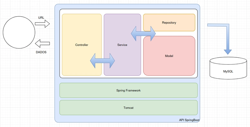
![Is this too much for a modular monolith system? [closed]](https://i.sstatic.net/pYL1nsfg.png)


_Andreas_Prott_Alamy.jpg?width=1280&auto=webp&quality=80&disable=upscale#)


![What features do you get with Gemini Advanced? [April 2025]](https://i0.wp.com/9to5google.com/wp-content/uploads/sites/4/2024/02/gemini-advanced-cover.jpg?resize=1200%2C628&quality=82&strip=all&ssl=1)


![Apple Shares Official Trailer for 'Long Way Home' Starring Ewan McGregor and Charley Boorman [Video]](https://www.iclarified.com/images/news/97069/97069/97069-640.jpg)
![Apple Watch Series 10 Back On Sale for $299! [Lowest Price Ever]](https://www.iclarified.com/images/news/96657/96657/96657-640.jpg)
![EU Postpones Apple App Store Fines Amid Tariff Negotiations [Report]](https://www.iclarified.com/images/news/97068/97068/97068-640.jpg)
![Apple Slips to Fifth in China's Smartphone Market with 9% Decline [Report]](https://www.iclarified.com/images/news/97065/97065/97065-640.jpg)


Creating Fluid Animations with Framer Motion
TLDR; Learn how to create smooth, engaging animations in React applications using Framer Motion with practical examples and best practices.' Animations can turn a static screen into a vibrant experience—much like the gentle sway of a flourishing garden. Framer Motion is your go-to tool for crafting dynamic, engaging animations in React that feel natural and refined. Getting Started First, install Framer Motion: npm install framer-motion # or yarn add framer-motion # or pnpm add framer-motion The magic begins with the motion component, which brings an element to life: import { motion } from 'framer-motion'; export default function AnimatedBox() { return ( ); } Animation Fundamentals The Animate Prop The animate prop tells your component its final state. For example: Transitions Customize your animations with the transition prop. Framer Motion supports several types: Hover and Tap Interactions Add interactivity using whileHover and whileTap: Hover & Click Me Advanced Animation Techniques Variants for Coordinated Animations Variants let you manage complex animations by defining states outside your JSX: const cardVariants = { hidden: { opacity: 0, y: 20 }, visible: { opacity: 1, y: 0, transition: { duration: 0.5, staggerChildren: 0.1 }, }, }; const itemVariants = { hidden: { opacity: 0, x: -20 }, visible: { opacity: 1, x: 0, transition: { duration: 0.3 }, }, }; function Card() { return ( Card Title Content that feels as gentle as a breeze over ripe blueberries. Learn More ); }

TLDR; Learn how to create smooth, engaging animations in React applications using Framer Motion with practical examples and best practices.'
Animations can turn a static screen into a vibrant experience—much like the gentle sway of a flourishing garden.
Framer Motion is your go-to tool for crafting dynamic, engaging animations in React that feel natural and refined.
Getting Started
First, install Framer Motion:
npm install framer-motion
# or
yarn add framer-motion
# or
pnpm add framer-motion
The magic begins with the motion component, which brings an element to life:
import { motion } from 'framer-motion';

export default function AnimatedBox() {
  return (
    <motion.div
      initial={{ opacity: 0, y: 20 }}
      animate={{ opacity: 1, y: 0 }}
      transition={{ duration: 0.5 }}
      className="w-32 h-32 bg-blue-500 rounded-lg"
    />
  );
}
Animation Fundamentals
The Animate Prop
The animate prop tells your component its final state. For example:
<motion.div
  animate={{
    x: 100,
    backgroundColor: '#ff0000',
    boxShadow: '10px 10px 0 rgba(0, 0, 0, 0.2)',
    rotate: 180,
    scale: 1.2,
  }}
/>
Transitions
Customize your animations with the transition prop. Framer Motion supports several types:
<motion.div
  animate={{ x: 100 }}
  transition={{
    type: 'spring',
    stiffness: 260,
    damping: 20,
    delay: 0.2,
  }}
/>
Hover and Tap Interactions
Add interactivity using whileHover and whileTap:
<motion.button
  whileHover={{ scale: 1.05 }}
  whileTap={{ scale: 0.95 }}
  className="px-4 py-2 bg-purple-600 text-white rounded-md"
>
  Hover & Click Me
motion.button>
Advanced Animation Techniques
Variants for Coordinated Animations
Variants let you manage complex animations by defining states outside your JSX:
const cardVariants = {
  hidden: { opacity: 0, y: 20 },
  visible: {
    opacity: 1,
    y: 0,
    transition: { duration: 0.5, staggerChildren: 0.1 },
  },
};

const itemVariants = {
  hidden: { opacity: 0, x: -20 },
  visible: {
    opacity: 1,
    x: 0,
    transition: { duration: 0.3 },
  },
};

function Card() {
  return (
    <motion.div
      variants={cardVariants}
      initial="hidden"
      animate="visible"
      className="p-6 bg-white rounded-lg shadow-lg"
    >
      <motion.h2 variants={itemVariants} className="text-xl mb-4">
        Card Title
      motion.h2>
      <motion.p variants={itemVariants} className="mb-4">
        Content that feels as gentle as a breeze over ripe blueberries.
      motion.p>
      <motion.button
        variants={itemVariants}
        className="px-4 py-2 bg-blue-500 text-white rounded"
      >
        Learn More
      motion.button>
    motion.div>
  );
}