


![[Webinar] AI Is Already Inside Your SaaS Stack — Learn How to Prevent the Next Silent Breach](https://blogger.googleusercontent.com/img/b/R29vZ2xl/AVvXsEiOWn65wd33dg2uO99NrtKbpYLfcepwOLidQDMls0HXKlA91k6HURluRA4WXgJRAZldEe1VReMQZyyYt1PgnoAn5JPpILsWlXIzmrBSs_TBoyPwO7hZrWouBg2-O3mdeoeSGY-l9_bsZB7vbpKjTSvG93zNytjxgTaMPqo9iq9Z5pGa05CJOs9uXpwHFT4/s1600/ai-cyber.jpg?#)


![[The AI Show Episode 144]: ChatGPT’s New Memory, Shopify CEO’s Leaked “AI First” Memo, Google Cloud Next Releases, o3 and o4-mini Coming Soon & Llama 4’s Rocky Launch](https://www.marketingaiinstitute.com/hubfs/ep%20144%20cover.png)


![Rogue Company Elite tier list of best characters [April 2025]](https://media.pocketgamer.com/artwork/na-33136-1657102075/rogue-company-ios-android-tier-cover.jpg?#)


_Andreas_Prott_Alamy.jpg?width=1280&auto=webp&quality=80&disable=upscale#)


![What’s new in Android’s April 2025 Google System Updates [U: 4/18]](https://i0.wp.com/9to5google.com/wp-content/uploads/sites/4/2025/01/google-play-services-3.jpg?resize=1200%2C628&quality=82&strip=all&ssl=1)


![Apple Watch Series 10 Back On Sale for $299! [Lowest Price Ever]](https://www.iclarified.com/images/news/96657/96657/96657-640.jpg)
![EU Postpones Apple App Store Fines Amid Tariff Negotiations [Report]](https://www.iclarified.com/images/news/97068/97068/97068-640.jpg)
![Apple Slips to Fifth in China's Smartphone Market with 9% Decline [Report]](https://www.iclarified.com/images/news/97065/97065/97065-640.jpg)


Creating a Page Graph with Firebase Studio
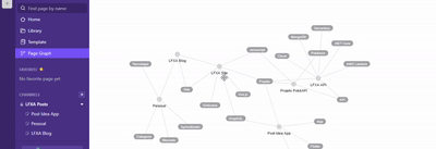
In my search for productivity tools, I came across the Additor extension a while ago — a handy solution for organizing notes. But what really caught my attention was the page graph visualization (very similar to what Obsidian offers). It wasn’t just nice — it was useful. A dynamic mental map of how content connects. That idea stuck with me. And one day I thought: why not build my own page graph? From a Vague Idea to a Real Project With that idea in mind, I decided to try out Firebase Studio, a tool that integrates AI to support web development. I wasn’t exactly sure how to phrase what I wanted, so I typed something like: "I’d like to create an interactive page graph, kind of like Obsidian’s." The AI (in this case, Gemini) replied: "I can’t create something exactly like Obsidian’s, but I can show you how to build something similar using the vis.js library..." And that’s when everything started to fall into place. AI as a Creative Partner Tools like Firebase Studio (and others like Gemini, Copilot, ChatGPT) have really changed the game. They speed up development, unlock ideas, and show paths we might not have considered on our own. In my case, they introduced me to vis.js, a visualization library that turned out to be the perfect fit for building an interactive page graph inside my Vue app. But here’s the thing: AI does not replace a developer’s critical thinking. It can suggest libraries, generate boilerplate code, even spin up a working example. But understanding why a structure makes sense, adapting it to your context, and handling the nuances of your system — that’s still on us. At the end of the day, AI is a great assistant, but you’re still the architect. How Did It Turn Out? I used vis.js to create an interactive graph of blog posts, connecting tags and content as nodes and edges in a visual map. The structure starts with a few fixed nodes — like “programming,” “frontend,” “personal” — and the remaining nodes are added dynamically based on the tags in each post. The result is a visual map of content creation: easy to explore and surprisingly beautiful to look at. I built it with Vue, added light/dark theme support, translations via Vue I18n, and a few reactive config options. You can check it out here: https://lfxa.vercel.app/en-US/graph Final Thoughts This project was the result of curiosity + inspiration + modern tools. It’s proof that, with a little push from AI, you can turn a vague idea into something functional — as long as you’re willing to think, adapt, and build it yourself. If you’re also into visualizations, productivity, or just looking to bring an idea to life, here’s my advice: start simple, play with AI tools, but never stop thinking like a problem solver. Because at the end of the day, you’re the one who turns suggestions into solutions. Trust in the Lord with all your heart and lean not on your own understanding. Proverbs 3:5
In my search for productivity tools, I came across the Additor extension a while ago — a handy solution for organizing notes. But what really caught my attention was the page graph visualization (very similar to what Obsidian offers). It wasn’t just nice — it was useful. A dynamic mental map of how content connects.
That idea stuck with me. And one day I thought: why not build my own page graph?
From a Vague Idea to a Real Project
With that idea in mind, I decided to try out Firebase Studio, a tool that integrates AI to support web development. I wasn’t exactly sure how to phrase what I wanted, so I typed something like:
"I’d like to create an interactive page graph, kind of like Obsidian’s."
The AI (in this case, Gemini) replied:
"I can’t create something exactly like Obsidian’s, but I can show you how to build something similar using the vis.js library..."
And that’s when everything started to fall into place.
AI as a Creative Partner
Tools like Firebase Studio (and others like Gemini, Copilot, ChatGPT) have really changed the game. They speed up development, unlock ideas, and show paths we might not have considered on our own. In my case, they introduced me to vis.js, a visualization library that turned out to be the perfect fit for building an interactive page graph inside my Vue app.
But here’s the thing: AI does not replace a developer’s critical thinking.
It can suggest libraries, generate boilerplate code, even spin up a working example. But understanding why a structure makes sense, adapting it to your context, and handling the nuances of your system — that’s still on us. At the end of the day, AI is a great assistant, but you’re still the architect.
How Did It Turn Out?

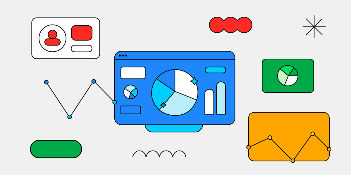
I used vis.js to create an interactive graph of blog posts, connecting tags and content as nodes and edges in a visual map. The structure starts with a few fixed nodes — like “programming,” “frontend,” “personal” — and the remaining nodes are added dynamically based on the tags in each post.
The result is a visual map of content creation: easy to explore and surprisingly beautiful to look at. I built it with Vue, added light/dark theme support, translations via Vue I18n, and a few reactive config options.
You can check it out here: https://lfxa.vercel.app/en-US/graph
Final Thoughts
This project was the result of curiosity + inspiration + modern tools. It’s proof that, with a little push from AI, you can turn a vague idea into something functional — as long as you’re willing to think, adapt, and build it yourself.
If you’re also into visualizations, productivity, or just looking to bring an idea to life, here’s my advice: start simple, play with AI tools, but never stop thinking like a problem solver.
Because at the end of the day, you’re the one who turns suggestions into solutions.
Trust in the Lord with all your heart and lean not on your own understanding. Proverbs 3:5