


![[The AI Show Episode 142]: ChatGPT’s New Image Generator, Studio Ghibli Craze and Backlash, Gemini 2.5, OpenAI Academy, 4o Updates, Vibe Marketing & xAI Acquires X](https://www.marketingaiinstitute.com/hubfs/ep%20142%20cover.png)


![[DEALS] The Premium Learn to Code Certification Bundle (97% off) & Other Deals Up To 98% Off – Offers End Soon!](https://www.javacodegeeks.com/wp-content/uploads/2012/12/jcg-logo.jpg)

![From drop-out to software architect with Jason Lengstorf [Podcast #167]](https://cdn.hashnode.com/res/hashnode/image/upload/v1743796461357/f3d19cd7-e6f5-4d7c-8bfc-eb974bc8da68.png?#)


.png?#)


_Christophe_Coat_Alamy.jpg?#)
 (1).webp?#)


![Apple Considers Delaying Smart Home Hub Until 2026 [Gurman]](https://www.iclarified.com/images/news/96946/96946/96946-640.jpg)
![iPhone 17 Pro Won't Feature Two-Toned Back [Gurman]](https://www.iclarified.com/images/news/96944/96944/96944-640.jpg)
![Tariffs Threaten Apple's $999 iPhone Price Point in the U.S. [Gurman]](https://www.iclarified.com/images/news/96943/96943/96943-640.jpg)


Biblioteca de componentes React e typescript, parte 3: testes unitários com Jest e testing library
Introdução English version: React and typescript components lib, part 3: unit tests with Jest and testing library Na parte três da série, será incrementada a lib com a definição de testes unitários usando Jest e testing library. A ideia é colocar mais a parte prática de adição nesse artigo, para quem quiser entender mais a fundo como funciona de forma geral escrevi o artigo Setup Jest, Babel e testing library para testes unitários em React referente a parte do setup e o artigo Testes unitários em React com Jest e testing library com o geral de como escrever e como funcionam os testes. Motivo testes unitários Dado que está sendo criada uma biblioteca de componentes, o principal intuito é garantir que cada componente a ser disponibilizado tenha sua integridade validada de forma isolada. Libs Jest: framework de testes criado pelo Facebook, de simples configuração e uso, que permite rodar testes de forma isolada Testing library: lib leve que permite simular interações com os componentes da aplicação jest-styled-components: lib que facilita os testes de componentes estilizados com styled-components Setup Jest Adição das principais libs para configurar o Jest: yarn add jest jest-environment-jsdom @babel/core @babel/preset-env @babel/preset-react @babel/preset-typescript --dev jest-environment-jsdom: simula um ambiente DOM como se estivesse no navegador para os testes @babel/preset-env: permite usar a versão mais recente de javascript, sem precisar definir quais transformações de sintaxe são necessárias para ser compatível com o ambiente que vai ser utilizado @babel/preset-react: permite compilar código React @babel/preset-typescript: permite a transpilação de typescript @babel/core: traz a base do Babel para a aplicação No momento desse artigo gerou as seguintes versões: "@babel/core": "^7.26.10", "@babel/preset-env": "^7.26.9", "@babel/preset-react": "^7.26.3", "@babel/preset-typescript": "^7.26.0", "jest": "^29.7.0", "jest-environment-jsdom": "^29.7.0" Vão ser adicionados dois arquivos de configuração na raiz do projeto: babel.config.js module.exports = { presets: [ ["@babel/preset-env", {targets: {node: "current"}}], "@babel/preset-typescript", "@babel/preset-react" ], }; Onde estão sendo usadas as libs de preset adicionadas. jest.config.js module.exports = { testEnvironment: "jsdom", testMatch: [ "**/src/components/**/*.test.tsx", ], }; Onde em testEnvironment está se definindo para usar o ambiente de teste jsdom, que vem da lib jest-environment-jsdom. E em testMatch está se definindo em que lugar vai se localizar os arquivos de teste, como os testes vão ser criados dentro da pasta de cada componente, foi definido o caminho acima. Setup testing library Adição das principais libs: yarn add @testing-library/react @testing-library/dom @testing-library/jest-dom @types/react @types/react-dom @types/jest --dev @testing-library/react: adiciona a testing-library para uso em aplicações React @testing-library/dom: peer dependência da @testing-library/react @testing-library/jest-dom: traz uma maior quantidade de matchers para os testes de Jest, fazendo eles mais declarativos @types/react: definição de types para React @types/react-dom: definição de types para react-dom @types/jest: definição de types para jest No momento desse artigo gerou as seguintes versões: "@testing-library/dom": "^10.4.0", "@testing-library/jest-dom": "^6.6.3", "@testing-library/react": "^16.2.0", "@types/jest": "^29.5.14", "@types/react": "^19.0.10", "@types/react-dom": "^19.0.4", Setup jest-styled-components Em ambos artigos de referência que coloquei na introdução, não foi abordado sobre essa lib, então vou falar um pouco sobre o que ela faz nesse artigo. Essa lib busca facilitar a realização de testes para componentes que usam styled-components. Relembrando os componentes que estão criados na lib: Text.tsx import React from "react"; import styled from "styled-components"; export interface TextProps { children: React.ReactNode; color?: string; weight?: "normal" | "bold"; fontWeight?: number; fontSize?: string; fontFamily?: string; } export interface StyledTextProps { $color?: string; $weight?: "normal" | "bold"; $fontWeight?: number; $fontSize?: string; $fontFamily?: string; } export const StyledText = styled.span` color: ${(props) => (props.$color ? props.$color : "#000")}; font-size: ${(props) => (props.$fontSize ? props.$fontSize : "16px")}; font-weight: ${(props) => props.$fontWeight ? props.$fontWeight : props.$weight ? props.$weight : "normal"}; font-family: ${(props) => (props.$fontFamily ? props.$fontFamily : "Arial")}; `; const Text = ({ children, color, weight, fontWeight, fontSize, fontFamily, }: TextProps) => ( {children} ); export default Text; Tag.tsx import React from "r
Introdução
English version: React and typescript components lib, part 3: unit tests with Jest and testing library
Na parte três da série, será incrementada a lib com a definição de testes unitários usando Jest e testing library. A ideia é colocar mais a parte prática de adição nesse artigo, para quem quiser entender mais a fundo como funciona de forma geral escrevi o artigo Setup Jest, Babel e testing library para testes unitários em React referente a parte do setup e o artigo Testes unitários em React com Jest e testing library com o geral de como escrever e como funcionam os testes.
Motivo testes unitários
Dado que está sendo criada uma biblioteca de componentes, o principal intuito é garantir que cada componente a ser disponibilizado tenha sua integridade validada de forma isolada.
Libs
Jest: framework de testes criado pelo Facebook, de simples configuração e uso, que permite rodar testes de forma isolada
Testing library: lib leve que permite simular interações com os componentes da aplicação
jest-styled-components: lib que facilita os testes de componentes estilizados com styled-components
Setup Jest
Adição das principais libs para configurar o Jest:
yarn add jest jest-environment-jsdom @babel/core @babel/preset-env @babel/preset-react @babel/preset-typescript --dev
-
jest-environment-jsdom: simula um ambiente DOM como se estivesse no navegador para os testes -
@babel/preset-env: permite usar a versão mais recente de javascript, sem precisar definir quais transformações de sintaxe são necessárias para ser compatível com o ambiente que vai ser utilizado -
@babel/preset-react: permite compilar código React -
@babel/preset-typescript: permite a transpilação de typescript -
@babel/core: traz a base do Babel para a aplicação
No momento desse artigo gerou as seguintes versões:
"@babel/core": "^7.26.10",
"@babel/preset-env": "^7.26.9",
"@babel/preset-react": "^7.26.3",
"@babel/preset-typescript": "^7.26.0",
"jest": "^29.7.0",
"jest-environment-jsdom": "^29.7.0"
Vão ser adicionados dois arquivos de configuração na raiz do projeto:
- babel.config.js
module.exports = {
  presets: [
    ["@babel/preset-env", {targets: {node: "current"}}],
    "@babel/preset-typescript",
    "@babel/preset-react"
  ],
};
Onde estão sendo usadas as libs de preset adicionadas.
- jest.config.js
module.exports = {
  testEnvironment: "jsdom",
  testMatch: [
    "**/src/components/**/*.test.tsx",
  ],
};
Onde em testEnvironment está se definindo para usar o ambiente de teste jsdom, que vem da lib jest-environment-jsdom. E em testMatch está se definindo em que lugar vai se localizar os arquivos de teste, como os testes vão ser criados dentro da pasta de cada componente, foi definido o caminho acima.
Setup testing library
Adição das principais libs:
yarn add @testing-library/react @testing-library/dom @testing-library/jest-dom @types/react @types/react-dom @types/jest --dev
-
@testing-library/react: adiciona a testing-library para uso em aplicações React -
@testing-library/dom: peer dependência da@testing-library/react -
@testing-library/jest-dom: traz uma maior quantidade de matchers para os testes de Jest, fazendo eles mais declarativos -
@types/react: definição de types para React -
@types/react-dom: definição de types para react-dom -
@types/jest: definição de types para jest
No momento desse artigo gerou as seguintes versões:
"@testing-library/dom": "^10.4.0",
"@testing-library/jest-dom": "^6.6.3",
"@testing-library/react": "^16.2.0",
"@types/jest": "^29.5.14",
"@types/react": "^19.0.10",
"@types/react-dom": "^19.0.4",
Setup jest-styled-components
Em ambos artigos de referência que coloquei na introdução, não foi abordado sobre essa lib, então vou falar um pouco sobre o que ela faz nesse artigo.
Essa lib busca facilitar a realização de testes para componentes que usam styled-components. Relembrando os componentes que estão criados na lib:
- Text.tsx
import React from "react";
import styled from "styled-components";

export interface TextProps {
  children: React.ReactNode;
  color?: string;
  weight?: "normal" | "bold";
  fontWeight?: number;
  fontSize?: string;
  fontFamily?: string;
}

export interface StyledTextProps {
  $color?: string;
  $weight?: "normal" | "bold";
  $fontWeight?: number;
  $fontSize?: string;
  $fontFamily?: string;
}

export const StyledText = styled.span<StyledTextProps>`
  color: ${(props) => (props.$color ? props.$color : "#000")};
  font-size: ${(props) => (props.$fontSize ? props.$fontSize : "16px")};
  font-weight: ${(props) =>
    props.$fontWeight
      ? props.$fontWeight
      : props.$weight
        ? props.$weight
        : "normal"};
  font-family: ${(props) => (props.$fontFamily ? props.$fontFamily : "Arial")};
`;

const Text = ({
  children,
  color,
  weight,
  fontWeight,
  fontSize,
  fontFamily,
}: TextProps) => (
  <StyledText
    $color={color}
    $weight={weight}
    $fontWeight={fontWeight}
    $fontSize={fontSize}
    $fontFamily={fontFamily}
  >
    {children}
  </StyledText>
);

export default Text;
- Tag.tsx
import React from "react";
import styled from "styled-components";
import Text from "../Text/Text";

export interface TagProps {
  type?: "default" | "success" | "alert" | "error";
  text: string;
  textColor?: string;
  textWeight?: "normal" | "bold";
  textFontWeight?: number;
  textFontSize?: string;
  textFontFamily?: string;
  backgroundColor?: string;
  format?: "default" | "semiRounded" | "rounded";
  borderRadius?: string;
  size?: "small" | "medium" | "large";
  padding?: string;
}

export interface StyledTagProps {
  $type?: "default" | "success" | "alert" | "error";
  $textColor?: string;
  $textWeight?: "normal" | "bold";
  $textFontWeight?: number;
  $textFontSize?: string;
  $textFontFamily?: string;
  $backgroundColor?: string;
  $format?: "default" | "semiRounded" | "rounded";
  $borderRadius?: string;
  $size?: "small" | "medium" | "large";
  $padding?: string;
}

export const StyledTag = styled.div<StyledTagProps>`
  border: none;
  padding: ${(props) =>
    props.$padding
      ? props.$padding
      : props.$size === "large"
        ? "15px 20px"
        : props.$size === "medium"
          ? "10px 12px"
          : "7px"};
  background-color: ${(props) =>
    props.$backgroundColor
      ? props.$backgroundColor
      : props.$type === "error"
        ? "#e97451"
        : props.$type === "alert"
          ? "#f8de7e"
          : props.$type === "success"
            ? "#50c878"
            : "#d3d3d3"};
  pointer-events: none;
  border-radius: ${(props) =>
    props.$borderRadius
      ? props.$borderRadius
      : props.$format === "rounded"
        ? "30px"
        : props.$format === "semiRounded"
          ? "5px"
          : "0"};
  width: fit-content;
`;

const Tag = ({
  text,
  type,
  textColor,
  textWeight,
  textFontWeight,
  textFontSize,
  textFontFamily,
  backgroundColor,
  format,
  borderRadius,
  size,
  padding,
}: TagProps) => (
  <StyledTag
    data-testid="tag"
    $type={type}
    $backgroundColor={backgroundColor}
    $format={format}
    $borderRadius={borderRadius}
    $size={size}
    $padding={padding}
  >
    <Text
      color={textColor || "#fff"}
      weight={textWeight}
      fontWeight={textFontWeight}
      fontSize={textFontSize}
      fontFamily={textFontFamily}
    >
      {text}
    </Text>
  </StyledTag>
);

export default Tag;
Nos dois componentes as propriedades de estilização são definidas usando styled-componentes: StyledText e StyledTag, onde tem algumas propriedades default, se as props não forem passadas para os componentes, ou varia as propriedades se forem passadas props. A lib do jest-styled-components fornece um matcher chamado toHaveStyleRule, que valida dado uma props passada, se via styled-componentes está sendo obtida a estilização esperada para o componente.
Adição da lib:
yarn add jest-styled-components --dev
No momento desse artigo gerou a seguinte versão:
"jest-styled-components": "^7.2.0"
Adição testes
Uma vez que as libs foram adicionadas e configuradas, serão adicionados os testes unitários para os dois componentes, dentro da pasta onde é definido o componente em si.
- Text.test.tsx
import React from "react";
import "@testing-library/jest-dom";
import "jest-styled-components";
import { render, screen } from "@testing-library/react";
import Text from "./Text";
describe("- Tag.test.tsx
import React from "react";
import "@testing-library/jest-dom";
import "jest-styled-components";
import { render, screen, within } from "@testing-library/react";
import Tag from "./Tag";
describe("Em ambos os arquivos de teste, o primeiro teste analisa as propriedades default do componente. Os outros testes validam as propriedades após passar props que impactam elas, seja de propriedades pré-definidas ou customizáveis.
package.json
No momento o package.json está da forma abaixo:
{
  "name": "react-example-lib",
  "version": "0.2.0",
  "main": "dist/cjs/index.js",
  "module": "dist/esm/index.js",
  "types": "dist/index.d.ts",
  "files": [
    "dist"
  ],
  "license": "MIT",
  "repository": {
    "type": "git",
    "url": "https://github.com/griseduardo/react-example-lib.git"
  },
  "scripts": {
    "build": "rollup -c --bundleConfigAsCjs",
    "lint-src": "eslint src",
    "lint-src-fix": "eslint src --fix",
    "format-src": "prettier src --check",
    "format-src-fix": "prettier src --write"
  },
  "devDependencies": {
    "@babel/core": "^7.26.10",
    "@babel/preset-env": "^7.26.9",
    "@babel/preset-react": "^7.26.3",
    "@babel/preset-typescript": "^7.26.0",
    "@eslint/js": "^9.19.0",
    "@rollup/plugin-commonjs": "^28.0.2",
    "@rollup/plugin-node-resolve": "^16.0.0",
    "@rollup/plugin-terser": "^0.4.4",
    "@rollup/plugin-typescript": "11.1.6",
    "@testing-library/dom": "^10.4.0",
    "@testing-library/jest-dom": "^6.6.3",
    "@testing-library/react": "^16.2.0",
    "@types/jest": "^29.5.14",
    "@types/react": "^19.0.10",
    "@types/react-dom": "^19.0.4",
    "eslint": "^9.19.0",
    "eslint-plugin-react": "^7.37.4",
    "jest": "^29.7.0",
    "jest-environment-jsdom": "^29.7.0",
    "jest-styled-components": "^7.2.0",
    "prettier": "^3.4.2",
    "react": "^19.0.0",
    "react-dom": "^19.0.0",
    "rollup": "^4.30.1",
    "rollup-plugin-dts": "^6.1.1",
    "rollup-plugin-peer-deps-external": "^2.2.4",
    "styled-components": "^6.1.14",
    "typescript": "^5.7.3",
    "typescript-eslint": "^8.23.0"
  },
  "peerDependencies": {
    "react": "^19.0.0",
    "react-dom": "^19.0.0",
    "styled-components": "^6.1.14"
  }
}
Será adicionado um script para executar os testes test, além disso vai ser mudada a versão para 0.3.0, uma vez que uma nova versão da lib será disponibilizada:
{
  "name": "react-example-lib",
  "version": "0.3.0",
  "main": "dist/cjs/index.js",
  "module": "dist/esm/index.js",
  "types": "dist/index.d.ts",
  "files": [
    "dist"
  ],
  "license": "MIT",
  "repository": {
    "type": "git",
    "url": "https://github.com/griseduardo/react-example-lib.git"
  },
  "scripts": {
    "build": "rollup -c --bundleConfigAsCjs",
    "lint-src": "eslint src",
    "lint-src-fix": "eslint src --fix",
    "format-src": "prettier src --check",
    "format-src-fix": "prettier src --write",
    "test": "jest"
  },
  "devDependencies": {
    "@babel/core": "^7.26.10",
    "@babel/preset-env": "^7.26.9",
    "@babel/preset-react": "^7.26.3",
    "@babel/preset-typescript": "^7.26.0",
    "@eslint/js": "^9.19.0",
    "@rollup/plugin-commonjs": "^28.0.2",
    "@rollup/plugin-node-resolve": "^16.0.0",
    "@rollup/plugin-terser": "^0.4.4",
    "@rollup/plugin-typescript": "11.1.6",
    "@testing-library/dom": "^10.4.0",
    "@testing-library/jest-dom": "^6.6.3",
    "@testing-library/react": "^16.2.0",
    "@types/jest": "^29.5.14",
    "@types/react": "^19.0.10",
    "@types/react-dom": "^19.0.4",
    "eslint": "^9.19.0",
    "eslint-plugin-react": "^7.37.4",
    "jest": "^29.7.0",
    "jest-environment-jsdom": "^29.7.0",
    "jest-styled-components": "^7.2.0",
    "prettier": "^3.4.2",
    "react": "^19.0.0",
    "react-dom": "^19.0.0",
    "rollup": "^4.30.1",
    "rollup-plugin-dts": "^6.1.1",
    "rollup-plugin-peer-deps-external": "^2.2.4",
    "styled-components": "^6.1.14",
    "typescript": "^5.7.3",
    "typescript-eslint": "^8.23.0"
  },
  "peerDependencies": {
    "react": "^19.0.0",
    "react-dom": "^19.0.0",
    "styled-components": "^6.1.14"
  }
}
Arquivo CHANGELOG
No momento o CHANGELOG.md está da forma abaixo:
## 0.2.0

_Fev. 24, 2025_

- setup typescript-eslint and prettier
- add custom rules

## 0.1.0

_Jan. 29, 2025_

- initial config
Como uma nova versão será disponibilizada, será adicionado sobre o que foi modificado no arquivo:
## 0.3.0

_Mar. 24, 2025_

- setup jest and testing-library
- add components tests

## 0.2.0

_Fev. 24, 2025_

- setup typescript-eslint and prettier
- add custom rules

## 0.1.0

_Jan. 29, 2025_

- initial config
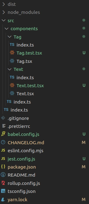
Estrutura de pastas
A estrutura de pastas está da seguinte forma, sendo que além da modificação de alguns arquivos, foi adicionado dois arquivos de configuração de testes e dois arquivos novos de teste de componentes:
Publicação nova versão
Primeiro passo a ser realizado é ver se a execução do rollup ocorre com sucesso. Para isso será executado o yarn build no terminal, que foi definido em package.json.
Executando com sucesso, é realizar a publicação da nova versão da lib: npm publish --access public
Conclusão
A ideia desse artigo foi fazer o setup e criar testes unitários para os componentes, usando Jest, testing-library e jest-styled-components, com uma visão mais prática de aplicação. Para entender como funciona a estrutura e execução dos testes, os artigos passados na introdução busca mostrar de forma mais detalhada esses pontos.
Segue o repositório no github e a lib no npmjs com as novas modificações.