Analysis of Key Technical Principles for a Visual Drag-and-Drop Component Library
Analysis of the Following Technical Points:
Editor
Custom Components
Drag and Drop
Deleting Components, Adjusting Layer Hierarchy
Zoom In and Out
Undo, Redo
Component Property Settings
Snapping
Preview, Save Code
Binding Events
Binding Animations
Importing PSD
Mobile Mode
To make this article easier to understand, I have combined the above technical points to create a visual drag-and-drop component library DEMO:
GitHub project address
Online preview
I recommend reading this alongside the source code for better results (this DEMO uses the Vue technology stack).
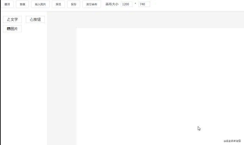
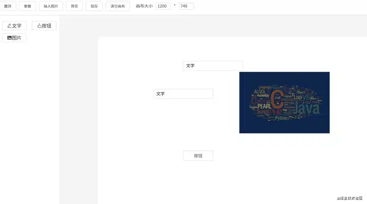
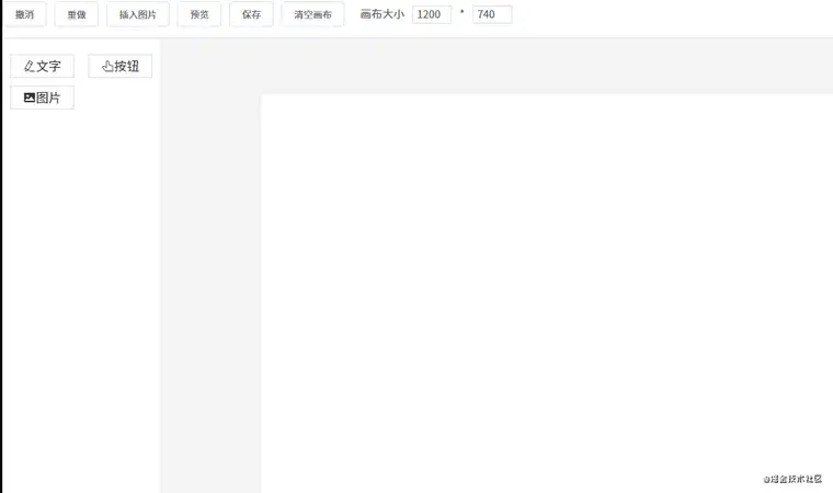
1. Editor
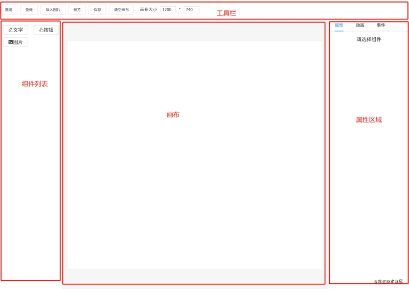
Let's first look at the overall structure of the page.
The editor discussed in this section is actually the canvas in the middle. Its role is: when a component is dragged from the left component list to the canvas, the canvas needs to render this component.
The implementation approach for this editor is:
Use an array componentData to maintain the data in the editor.
When a component is dragged to the canvas, use the push() method to add the new component data to componentData.
The editor uses the v-for directive to iterate through componentData, rendering each component one by one onto the canvas (you can also use JSX syntax with the render() method instead).
The core code for editor rendering is as follows:
Each component's data roughly looks like this:
{
    component: 'v-text', // Component name, needs to be pre-registered in Vue
    label: 'Text', // Name displayed in the left component list
    propValue: 'Text', // Value used by the component
    icon: 'el-icon-edit', // Icon displayed in the left component list
    animations: [], // Animation list
    events: {}, // Event list
    style: { // Component styles
        width: 200,
        height: 33,
        fontSize: 14,
        fontWeight: 500,
        lineHeight: '',
        letterSpacing: 0,
        textAlign: '',
        color: '',
    },
}
When iterating through the componentData, the is attribute is mainly used to identify which component should actually be rendered.
For example, if the component data to be rendered is { component: 'v-text' }, then will be converted to . Of course, you need to register this component in Vue beforehand.
If you want to learn more about the is attribute, please check the official documentation.
2. Custom Components
In principle, using third-party components is also possible, but it's recommended that you encapsulate them. Whether third-party components or custom components, each component may require different properties, so each component's data can expose a property called propValue for passing values.
For example, if component a only needs one property, your propValue can be written like this: propValue: 'aaa'. If multiple properties are needed, propValue can be an object:
propValue: {
  a: 1,
  b: 'text'
}
In this DEMO component library, I defined three components.
Image component Picture:
export default {
props: {
propValue: {
type: String,
require: true,
},
},
}
Button component VButton:
{{ propValue }}
export default {
props: {
propValue: {
type: String,
default: '',
},
},
}
Text component VText:
{{ text }}
import { mapState } from 'vuex'
export default {
props: {
propValue: {
type: String,
},
element: {
type: Object,
},
},
computed: mapState([
'editMode',
]),
methods: {
handleInput(e) {
this.$emit('input', this.element, e.target.value)
},
},
}
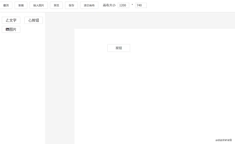
3. Drag and Drop
From Component List to Canvas
For an element to be made draggable, it must have a draggable attribute added to it. Additionally, when dragging components from the component list to the canvas, two events play a key role:
The dragstart event, triggered at the beginning of the drag. It's mainly used to pass the dragged component information to the canvas.
The drop event, triggered at the end of the drag. Mainly used to receive the dragged component information.
Let's first look at the code for the left component list:
{{ item.label }}
handleDragStart(e) {
    e.dataTransfer.setData('index', e.target.dataset.index)
}
You can see that the draggable attribute is set for each component in the list. Additionally, when the dragstart event is triggered, data is transmitted using dataTransfer.setData(). Now let's look at the code for receiving data:
handleDrop(e) {
    e.preventDefault()
    e.stopPropagation()
    const component = deepCopy(componentList[e.dataTransfer.getData('index')])
    this.$store.commit('addComponent', component)
}
When the drop event is triggered, dataTransfer.getData() is used to receive the transmitted index data, then the corresponding compon
Apr 7, 2025 - 13:39
0
Analysis of the Following Technical Points:
Editor
Custom Components
Drag and Drop
Deleting Components, Adjusting Layer Hierarchy
Zoom In and Out
Undo, Redo
Component Property Settings
Snapping
Preview, Save Code
Binding Events
Binding Animations
Importing PSD
Mobile Mode
To make this article easier to understand, I have combined the above technical points to create a visual drag-and-drop component library DEMO:
I recommend reading this alongside the source code for better results (this DEMO uses the Vue technology stack).
1. Editor
Let's first look at the overall structure of the page.
The editor discussed in this section is actually the canvas in the middle. Its role is: when a component is dragged from the left component list to the canvas, the canvas needs to render this component.
The implementation approach for this editor is:
Use an array componentData to maintain the data in the editor.
When a component is dragged to the canvas, use the push() method to add the new component data to componentData.
The editor uses the v-for directive to iterate through componentData, rendering each component one by one onto the canvas (you can also use JSX syntax with the render() method instead).
The core code for editor rendering is as follows:
<componentv-for="item in componentData":key="item.id":is="item.component":style="item.style":propValue="item.propValue"/>
Each component's data roughly looks like this:
{component:'v-text',// Component name, needs to be pre-registered in Vuelabel:'Text',// Name displayed in the left component listpropValue:'Text',// Value used by the componenticon:'el-icon-edit',// Icon displayed in the left component listanimations:[],// Animation listevents:{},// Event liststyle:{// Component styleswidth:200,height:33,fontSize:14,fontWeight:500,lineHeight:'',letterSpacing:0,textAlign:'',color:'',},}
When iterating through the componentData, the is attribute is mainly used to identify which component should actually be rendered.
For example, if the component data to be rendered is { component: 'v-text' }, then will be converted to . Of course, you need to register this component in Vue beforehand.
If you want to learn more about the is attribute, please check the official documentation.
2. Custom Components
In principle, using third-party components is also possible, but it's recommended that you encapsulate them. Whether third-party components or custom components, each component may require different properties, so each component's data can expose a property called propValue for passing values.
For example, if component a only needs one property, your propValue can be written like this: propValue: 'aaa'. If multiple properties are needed, propValue can be an object:
propValue:{a:1,b:'text'}
In this DEMO component library, I defined three components.
For an element to be made draggable, it must have a draggable attribute added to it. Additionally, when dragging components from the component list to the canvas, two events play a key role:
The dragstart event, triggered at the beginning of the drag. It's mainly used to pass the dragged component information to the canvas.
The drop event, triggered at the end of the drag. Mainly used to receive the dragged component information.
Let's first look at the code for the left component list:
@dragstart="handleDragStart"class="component-list">v-for="(item, index) in componentList":key="index"class="list"draggable:data-index="index">:class="item.icon">{{ item.label }}
You can see that the draggable attribute is set for each component in the list. Additionally, when the dragstart event is triggered, data is transmitted using dataTransfer.setData(). Now let's look at the code for receiving data:
When the drop event is triggered, dataTransfer.getData() is used to receive the transmitted index data, then the corresponding component data is found based on this index, and finally added to the canvas to render the component.
Moving Components on the Canvas
First, the canvas needs to be set to relative positioning position: relative, and then each component needs to be set to absolute positioning position: absolute. Apart from this, three events need to be monitored for movement:
The mousedown event, when the mouse is pressed on a component, record the component's current position, i.e., xy coordinates (for ease of explanation, I'm using coordinate axis here, but in reality, xy corresponds to left and top in CSS).
The mousemove event, each time the mouse moves, subtract the initial xy coordinates from the latest xy coordinates to calculate the distance moved, and then change the component's position.
The mouseup event, which ends the movement when the mouse is lifted.
handleMouseDown(e){e.stopPropagation()this.$store.commit('setCurComponent',{component:this.element,zIndex:this.zIndex})constpos={...this.defaultStyle}conststartY=e.clientYconststartX=e.clientX// To avoid the value type becoming a string when modifying properties directly, convert to numeric typeconststartTop=Number(pos.top)conststartLeft=Number(pos.left)constmove=(moveEvent)=>{constcurrX=moveEvent.clientXconstcurrY=moveEvent.clientYpos.top=currY-startY+startToppos.left=currX-startX+startLeft// Modify the current component stylethis.$store.commit('setShapeStyle',pos)}constup=()=>{document.removeEventListener('mousemove',move)document.removeEventListener('mouseup',up)}document.addEventListener('mousemove',move)document.addEventListener('mouseup',up)}
PS: Many users have reported lag when dragging; the solution is simple: just close your browser's console.
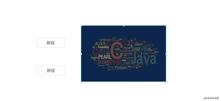
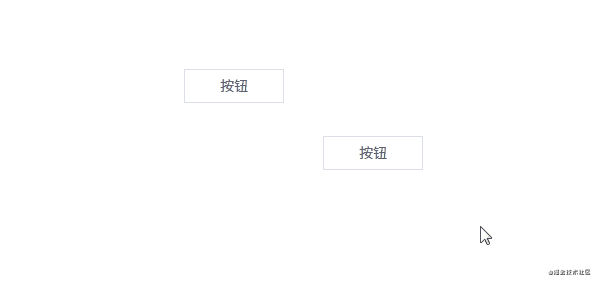
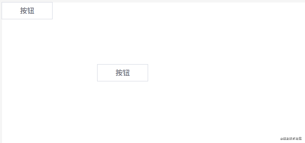
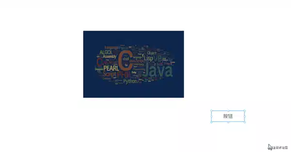
4. Deleting Components, Adjusting Layer Hierarchy
Changing Layer Hierarchy
Since dragging components to the canvas has a sequential order, we can allocate layer hierarchy based on the data order.
For example, if five components abcde are added to the canvas, their order in the canvas data is [a, b, c, d, e]. The layer hierarchy corresponds to the index one-to-one, meaning their z-index attribute values are 01234 (last one on top). This can be expressed in code as follows:
v-for="(item, index) in componentData":zIndex="index">
If you're not familiar with the z-index attribute, please check the MDN documentation.
With this understanding, changing the layer hierarchy becomes easy. Changing the layer hierarchy means changing the order of component data in the componentData array. For example, with three components [a, b, c], their layer hierarchy from low to high is abc (the larger the index, the higher the layer).
If you want to move component b up, just swap it with c:
Deleting components is very simple, just one line of code: componentData.splice(index, 1).
5. Zoom In and Out
Observant users may notice that when clicking on a component on the canvas, eight small dots appear on the component. These eight dots are used for zooming. The implementation principle is as follows:
1. Wrap each component in a Shape component, which contains 8 small dots and a for placing the component.
v-for="(item, index) in componentData":defaultStyle="item.style":style="getShapeStyle(item.style, index)":key="item.id":active="item === curComponent":element="item":zIndex="index">class="component":is="item.component":style="getComponentStyle(item.style)":propValue="item.propValue"/>
Internal structure of the Shape component:
class="shape":class="{ active: this.active }"@click="selectCurComponent"@mousedown="handleMouseDown"@contextmenu="handleContextMenu">class="shape-point"v-for="(item, index) in (active? pointList : [])"@mousedown="handleMouseDownOnPoint(item)":key="index":style="getPointStyle(item)">
2. When clicking on a component, display the 8 small dots.
This is achieved through the code line :active="item === curComponent".
3. Calculate the position of each small dot.
Let's look at the code for calculating the position of the small dots:
constpointList=['t','r','b','l','lt','rt','lb','rb']getPointStyle(point){const{width,height}=this.defaultStyleconsthasT=/t/.test(point)consthasB=/b/.test(point)consthasL=/l/.test(point)consthasR=/r/.test(point)letnewLeft=0letnewTop=0// Four corner dotsif (point.length===2){newLeft=hasL?0:widthnewTop=hasT?0:height}else{// Top and bottom dots, width centeredif (hasT||hasB){newLeft=width/2newTop=hasT?0:height}// Left and right dots, height centeredif (hasL||hasR){newLeft=hasL?0:widthnewTop=Math.floor(height/2)}}conststyle={marginLeft:hasR?'-4px':'-3px',marginTop:'-3px',left:`${newLeft}px`,top:`${newTop}px`,cursor:point.split('').reverse().map(m=>this.directionKey[m]).join('')+'-resize',}returnstyle}
Calculating the position of the small dots requires some information:
Component height height and width width
Note that the small dots are also absolutely positioned, relative to the Shape component. So the positions of four of the small dots are easy to determine:
The other four dots need to be calculated indirectly. For example, the middle-left dot's calculation formula is left: 0, top: height / 2, and similar for the other dots.
4. When clicking on a small dot, zooming operations can be performed.
handleMouseDownOnPoint(point){constdownEvent=window.eventdownEvent.stopPropagation()downEvent.preventDefault()constpos={...this.defaultStyle}constheight=Number(pos.height)constwidth=Number(pos.width)consttop=Number(pos.top)constleft=Number(pos.left)conststartX=downEvent.clientXconststartY=downEvent.clientY// Whether a snapshot needs to be savedletneedSave=falseconstmove=(moveEvent)=>{needSave=trueconstcurrX=moveEvent.clientXconstcurrY=moveEvent.clientYconstdisY=currY-startYconstdisX=currX-startXconsthasT=/t/.test(point)consthasB=/b/.test(point)consthasL=/l/.test(point)consthasR=/r/.test(point)constnewHeight=height+(hasT?-disY:hasB?disY:0)constnewWidth=width+(hasL?-disX:hasR?disX:0)pos.height=newHeight>0?newHeight:0pos.width=newWidth>0?newWidth:0pos.left=left+(hasL?disX:0)pos.top=top+(hasT?disY:0)this.$store.commit('setShapeStyle',pos)}constup=()=>{document.removeEventListener('mousemove',move)document.removeEventListener('mouseup',up)needSave&&this.$store.commit('recordSnapshot')}document.addEventListener('mousemove',move)document.addEventListener('mouseup',up)}
The principle is as follows:
When clicking on a small dot, record the clicked xy coordinates.
Let's say we drag downward, so the y coordinate increases.
Subtract the original y coordinate from the new y coordinate to determine how far we've moved in the vertical direction.
Finally, add the movement distance to the original component height to get the new component height.
If it's positive, it means we're dragging downward, increasing the component's height. If negative, we're dragging upward, decreasing the component's height.
6. Undo, Redo
The principle of undo and redo is actually quite simple, let's look at the code first:
snapshotData:[],// Editor snapshot datasnapshotIndex:-1,// Snapshot indexundo(state){if (state.snapshotIndex>=0){state.snapshotIndex--store.commit('setComponentData',deepCopy(state.snapshotData[state.snapshotIndex]))}},redo(state){if (state.snapshotIndex<state.snapshotData.length-1){state.snapshotIndex++store.commit('setComponentData',deepCopy(state.snapshotData[state.snapshotIndex]))}},setComponentData(state,componentData=[]){Vue.set(state,'componentData',componentData)},recordSnapshot(state){// Add a new snapshotstate.snapshotData[++state.snapshotIndex]=deepCopy(state.componentData)// During the undo process, when adding a new snapshot, clear the snapshots after itif (state.snapshotIndex<state.snapshotData.length-1){state.snapshotData=state.snapshotData.slice(0,state.snapshotIndex+1)}},
An array is used to save the editor's snapshot data. Saving a snapshot is a continuous push() operation, pushing the current editor data into the snapshotData array and increasing the snapshot index snapshotIndex. Currently, the following actions trigger the snapshot save operation:
Adding a component
Deleting a component
Changing layer hierarchy
When dragging components ends
...
Undo
Let's say snapshotData has saved 4 snapshots. That is, [a, b, c, d], with a corresponding snapshot index of 3. If an undo operation is performed now, we need to decrease the snapshot index by 1, and then assign the corresponding snapshot data to the canvas.
For example, if the current canvas data is d, after an undo, the index is -1, and now the canvas data is c.
Redo
With undo understood, redo is easy to comprehend—it's increasing the snapshot index by 1, and then assigning the corresponding snapshot data to the canvas.
However, there's one thing to note: what if a new operation is performed during the undo operation? There are two solutions:
Replace all data after the current snapshot index with the new operation. Using the data [a, b, c, d] from earlier as an example, let's say two undo operations have been performed, making the snapshot index 1, corresponding to snapshot data b. If a new operation is performed at this time, corresponding to snapshot data e, then e will replace cd, and the snapshot data becomes [a, b, e].
Don't replace data, but add a new record to the original snapshot. Using the previous example, e won't replace cd but will be inserted before cd, making the snapshot data [a, b, e, c, d].
I've adopted the first approach.
7. Snapping
What is snapping? When dragging a component, if it's relatively close to another component, it will automatically snap to it.
The snapping code is about 300 lines long, so I suggest looking at the source code file directly (file path: src\components\Editor\MarkLine.vue). I won't paste the code here, but I'll explain the principle of how it's implemented.
Markers
Create 6 lines on the page, 3 horizontal and 3 vertical. These 6 lines serve for alignment. When do they appear?
Vertical lines appear when two components in the up-down direction align on the left, middle, or right
Horizontal lines appear when two components in the left-right direction align on the top, middle, or bottom
The specific calculation formulas are mainly based on the xy coordinates and width/height of each component. For example, to determine if the left sides of two components a and b are aligned, we need to know the x-coordinate of each component; to determine if their right sides are aligned, we need to know not only the x-coordinate but also the width of each component.
// Condition for left alignmenta.x==b.x// Condition for right alignmenta.x+a.width==b.x+b.width
The markers are displayed during alignment.
Additionally, we need to determine if components a and b are "close enough". If they're close enough, they snap together. Whether they're close enough is determined by a variable:
diff:3,// Will automatically snap when within diff pixels
Automatic snapping occurs when less than or equal to diff pixels apart.
Snapping
How is the snapping effect implemented?
Let's say we have components a and b, with a's x and y coordinates both at 0, and its width and height both at 100. Now assume component a is stationary and we're dragging component b. When b is dragged to coordinates x: 0, y: 103, since 103 - 100 <= 3(diff), we can determine they're close enough. At this point, we manually set b's y-coordinate to 100, thus snapping components a and b together.
Optimization
Having all 6 markers displayed during dragging might not look aesthetically pleasing. So we can optimize it so that at most one line is displayed in each direction simultaneously. The implementation principle is as follows:
Component a is on the left and stationary, while we drag component b towards a.
At this point, the first alignment is between a's right side and b's left side, so only one line is needed.
If components a and b are already close, and b continues to move to the left, we now need to determine if their middles are aligned.
As b continues to be dragged, we need to determine if a's left side and b's right side are aligned, again needing just one line.
We can see that the key is knowing the direction of the two components. That is, when components a and b are close, we need to know whether b is to the left or right of a.
This can be determined through the mouse movement event. As mentioned earlier when discussing dragging, the mousedown event records the starting coordinates. So each time the mousemove event is triggered, by subtracting the original coordinates from the current ones, we can determine the component's direction. For example, in the x-direction, if the difference b.x - a.x is positive, b is to the right of a; otherwise, it's to the left.
// Trigger element movement event, used for displaying markers and snapping functionality// The last two parameters represent the mouse movement direction// currY - startY > 0 true means moving downward, false means moving upward// currX - startX > 0 true means moving to the right, false means moving to the lefteventBus.$emit('move',this.$el,currY-startY>0,currX-startX>0)
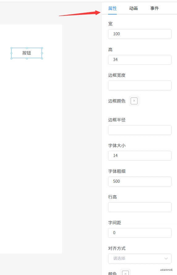
8. Component Property Settings
Each component has some common properties and unique properties, so we need to provide a place to display and modify these properties.
// Each component's data is roughly like this{component:'v-text',// Component name, needs to be pre-registered in Vuelabel:'Text',// Name displayed in the left component listpropValue:'Text',// Value used by the componenticon:'el-icon-edit',// Icon displayed in the left component listanimations:[],// Animation listevents:{},// Event liststyle:{// Component styleswidth:200,height:33,fontSize:14,fontWeight:500,lineHeight:'',letterSpacing:0,textAlign:'',color:'',},}
I defined an AttrList component to display each component's properties.
class="attr-list">v-for="(key, index) in styleKeys":key="index":label="map[key]">v-if="key == 'borderColor'"v-model="curComponent.style[key]">v-else-if="key == 'color'"v-model="curComponent.style[key]">v-else-if="key == 'backgroundColor'"v-model="curComponent.style[key]">v-else-if="key == 'textAlign'"v-model="curComponent.style[key]">v-for="item in options":key="item.value":label="item.label":value="item.value">type="number"v-elsev-model="curComponent.style[key]"/>label="Content"v-if="curComponent && curComponent.propValue && !excludes.includes(curComponent.component)">type="textarea"v-model="curComponent.propValue"/>
The code logic is simple: iterate through the component's style object, looping through each property. Different components need to be used to display different properties; for example, color properties need to be displayed with a color picker, while numeric properties need to be displayed with an input component of type=number, and so on.
To make it convenient for users to modify property values, I've used v-model to bind the component and value together.
9. Preview, Save Code
The rendering principles for preview and editing are the same, the difference being that preview doesn't need editing functionality. So we just need to slightly modify the code that renders components.
v-for="(item, index) in componentData":defaultStyle="item.style":style="getShapeStyle(item.style, index)":key="item.id":active="item === curComponent":element="item":zIndex="index">class="component":is="item.component":style="getComponentStyle(item.style)":propValue="item.propValue"/>
From the previous introductions, we know that the Shape component has drag-and-drop and resizing functionalities. Now we just need to remove the Shape component and change the outer container to a regular DIV (actually, we could do without this DIV, but for event binding functionality, we need to add it).
v-for="(item, index) in componentData":key="item.id">class="component":is="item.component":style="getComponentStyle(item.style)":propValue="item.propValue"/>
The code-saving feature is also very simple, just save the canvas data componentData. There are two options for saving:
Save to the server
Save locally
In the DEMO, I use localStorage to save locally.
10. Binding Events
Each component has an events object used to store bound events. Currently, I've only defined two events:
However, these events can't be triggered during editing but can be triggered during preview.
Adding Events
Render the event list using the v-for directive:
v-model="eventActiveName">v-for="item in eventList":key="item.key":label="item.label":name="item.key"style="padding: 0 20px">v-if="item.key == 'redirect'"v-model="item.param"type="textarea"placeholder="Please enter the complete URL"/>v-if="item.key == 'alert'"v-model="item.param"type="textarea"placeholder="Please enter the content to alert"/>style="margin-top: 20px;"@click="addEvent(item.key, item.param)">Confirm
When an event is selected, it's added to the component's events object.
Triggering Events
When previewing or actually rendering the page, each component also needs to be wrapped in a DIV. This way, a click event can be bound to the DIV, which triggers the events we added earlier when clicked.
handleClick(){constevents=this.config.events// Loop through and trigger bound eventsObject.keys(events).forEach(event=>{this[event](events[event])})}
11. Binding Animations
Animations work on the same principle as events: first render all animations using the v-for directive, then click on an animation to add the corresponding animation to the component's animations array. Just like with events, when executing, all of the component's animations are iterated through and executed.
For convenience, we use the animate.css animation library.
// main.jsimport'@/styles/animate.css'
Now let's predefine all the animation data:
exportdefault[{label:'Enter',children:[{label:'Fade In',value:'fadeIn'},{label:'Enter from Right',value:'fadeInLeft'},{label:'Enter from Left',value:'fadeInRight'},{label:'Enter from Top',value:'fadeInUp'},{label:'Enter from Bottom',value:'fadeInDown'},{label:'Enter from Right Long Distance',value:'fadeInLeftBig'},{label:'Enter from Left Long Distance',value:'fadeInRightBig'},{label:'Enter from Top Long Distance',value:'fadeInUpBig'},{label:'Enter from Bottom Long Distance',value:'fadeInDownBig'},{label:'Rotate In',value:'rotateIn'},{label:'Rotate Clockwise from Left',value:'rotateInDownLeft'},{label:'Rotate Counter-clockwise from Right',value:'rotateInDownRight'},{label:'Rotate Counter-clockwise from Left',value:'rotateInUpLeft'},{label:'Rotate Counter-clockwise from Right',value:'rotateInUpRight'},{label:'Bounce In',value:'bounceIn'},{label:'Bounce In from Right',value:'bounceInLeft'},{label:'Bounce In from Left',value:'bounceInRight'},{label:'Bounce In from Top',value:'bounceInUp'},{label:'Bounce In from Bottom',value:'bounceInDown'},{label:'Light Speed from Right',value:'lightSpeedInRight'},{label:'Light Speed from Left',value:'lightSpeedInLeft'},{label:'Light Speed Exit Right',value:'lightSpeedOutRight'},{label:'Light Speed Exit Left',value:'lightSpeedOutLeft'},{label:'Y-axis Rotation',value:'flip'},{label:'Center X-axis Rotation',value:'flipInX'},{label:'Center Y-axis Rotation',value:'flipInY'},{label:'Long Left Radius Rotation',value:'rollIn'},{label:'Grow from Small',value:'zoomIn'},{label:'Grow from Left',value:'zoomInLeft'},{label:'Grow from Right',value:'zoomInRight'},{label:'Grow from Top',value:'zoomInUp'},{label:'Grow from Bottom',value:'zoomInDown'},{label:'Slide Right and Expand',value:'slideInLeft'},{label:'Slide Left and Expand',value:'slideInRight'},{label:'Slide Up and Expand',value:'slideInUp'},{label:'Slide Down and Expand',value:'slideInDown'},],},{label:'Emphasis',children:[{label:'Bounce',value:'bounce'},{label:'Flash',value:'flash'},{label:'Grow and Shrink',value:'pulse'},{label:'Grow and Shrink (Spring)',value:'rubberBand'},{label:'Shake Left and Right',value:'headShake'},{label:'Fan-shaped Swing Left and Right',value:'swing'},{label:'Grow, Shake, Shrink',value:'tada'},{label:'Fan-shaped Swing',value:'wobble'},{label:'Shake Left, Right, Up, Down',value:'jello'},{label:'Y-axis Rotation',value:'flip'},],},{label:'Exit',children:[{label:'Fade Out',value:'fadeOut'},{label:'Exit to Left',value:'fadeOutLeft'},{label:'Exit to Right',value:'fadeOutRight'},{label:'Exit Upward',value:'fadeOutUp'},{label:'Exit Downward',value:'fadeOutDown'},{label:'Exit to Left Long Distance',value:'fadeOutLeftBig'},{label:'Exit to Right Long Distance',value:'fadeOutRightBig'},{label:'Exit Upward Long Distance',value:'fadeOutUpBig'},{label:'Exit Downward Long Distance',value:'fadeOutDownBig'},{label:'Rotate Out',value:'rotateOut'},{label:'Rotate Clockwise from Left',value:'rotateOutDownLeft'},{label:'Rotate Counter-clockwise from Right',value:'rotateOutDownRight'},{label:'Rotate Counter-clockwise from Left',value:'rotateOutUpLeft'},{label:'Rotate Counter-clockwise from Right',value:'rotateOutUpRight'},{label:'Bounce Out',value:'bounceOut'},{label:'Bounce Out to Left',value:'bounceOutLeft'},{label:'Bounce Out to Right',value:'bounceOutRight'},{label:'Bounce Out Upward',value:'bounceOutUp'},{label:'Bounce Out Downward',value:'bounceOutDown'},{label:'Center X-axis Rotation',value:'flipOutX'},{label:'Center Y-axis Rotation',value:'flipOutY'},{label:'Long Left Radius Rotation',value:'rollOut'},{label:'Shrink from Large',value:'zoomOut'},{label:'Shrink to Left',value:'zoomOutLeft'},{label:'Shrink to Right',value:'zoomOutRight'},{label:'Shrink Upward',value:'zoomOutUp'},{label:'Shrink Downward',value:'zoomOutDown'},{label:'Slide Left and Collapse',value:'slideOutLeft'},{label:'Slide Right and Collapse',value:'slideOutRight'},{label:'Slide Up and Collapse',value:'slideOutUp'},{label:'Slide Down and Collapse',value:'slideOutDown'},],},]
Then use the v-for directive to render out the animation list.
Adding Animations
v-model="animationActiveName">v-for="item in animationClassData":key="item.label":label="item.label":name="item.label">class="animate-container">class="animate"v-for="(animate, index) in item.children":key="index"@mouseover="hoverPreviewAnimate = animate.value"@click="addAnimation(animate)">:class="[hoverPreviewAnimate === animate.value && animate.value + ' animated']">{{ animate.label }}
Clicking on an animation will call addAnimation(animate) to add the animation to the component's animations array.
Running animations requires two parameters: the DOM element corresponding to the component (obtained with this.$el in the component) and its animation data animations. It also needs to listen for the animationend event and the animationcancel event: one is triggered when the animation ends, the other when the animation is unexpectedly terminated.
Using this in combination with Promise, you can run each of the component's animations one by one.
12. Importing PSD
Due to time constraints, I haven't implemented this feature yet. Here's a brief description of how to implement it. Use the psd.js library, which can parse PSD files.
The data obtained by parsing PSD files using the psd library looks like this:
{children:[{type:'group',visible:false,opacity:1,blendingMode:'normal',name:'Version D',left:0,right:900,top:0,bottom:600,height:600,width:900,children:[{type:'layer',visible:true,opacity:1,blendingMode:'normal',name:'Make a change and save.',left:275,right:636,top:435,bottom:466,height:31,width:361,mask:{},text:{value:'Make a change and save.',font:{name:'HelveticaNeue-Light',sizes:[33],colors:[[85,96,110,255]],alignment:['center']},left:0,top:0,right:0,bottom:0,transform:{xx:1,xy:0,yx:0,yy:1,tx:456,ty:459}},image:{}}]}],document:{width:900,height:600,resources:{layerComps:[{id:692243163,name:'Version A',capturedInfo:1},{id:725235304,name:'Version B',capturedInfo:1},{id:730932877,name:'Version C',capturedInfo:1}],guides:[],slices:[]}}}
From the code above, we can see that this data is very similar to CSS. Based on this observation, we only need to write a conversion function to convert this data into the data required by our components, thus implementing the functionality of converting PSD files into rendered components. Currently, quark-h5 and luban-h5 both implement PSD conversion functionality in this way.
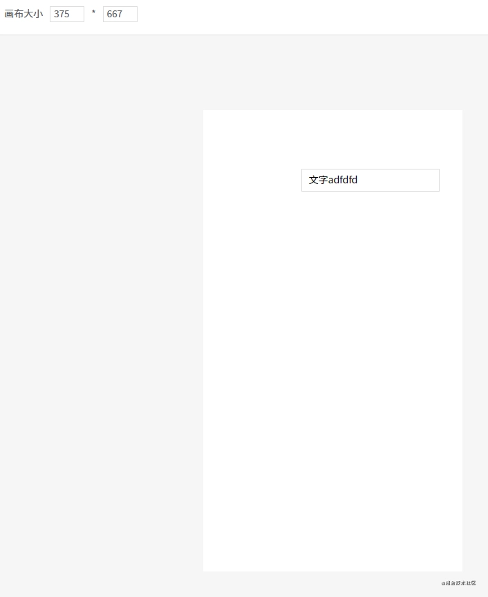
13. Mobile Mode
Since the canvas size can be adjusted, we can use the iPhone 6 resolution to develop mobile pages.
Pages developed this way can also be viewed normally on mobile devices, but there may be style discrepancies. This is because my three custom components are not made responsive. If you need to develop mobile pages, you must use a mobile UI component library for your custom components, or develop custom components specifically for mobile use.
Conclusion
Since the DEMO code is quite extensive, when explaining each feature point, I only included the key code. So you'll find that the source code of the DEMO differs somewhat from the code I've presented here, but please don't be concerned about this.
Additionally, the styling of the DEMO is rather rudimentary, mainly because I've been quite busy recently and haven't had much time to make it more visually appealing, so please bear with me.


![[The AI Show Episode 142]: ChatGPT’s New Image Generator, Studio Ghibli Craze and Backlash, Gemini 2.5, OpenAI Academy, 4o Updates, Vibe Marketing & xAI Acquires X](https://www.marketingaiinstitute.com/hubfs/ep%20142%20cover.png)


![From drop-out to software architect with Jason Lengstorf [Podcast #167]](https://cdn.hashnode.com/res/hashnode/image/upload/v1743796461357/f3d19cd7-e6f5-4d7c-8bfc-eb974bc8da68.png?#)


![Switch 2 Pre-Order Rules Are Some BS: Here's How They Work [Update]](https://i.kinja-img.com/image/upload/c_fill,h_675,pg_1,q_80,w_1200/485ec87fd3cea832387b2699e4cbd2a1.jpg)


.png?#)


.jpeg?#)
(1).jpg?width=1920&height=1920&fit=bounds&quality=80&format=jpg&auto=webp#)


-Mario-Kart-World-Hands-On-Preview-Is-It-Good-00-08-36.jpg?width=1920&height=1920&fit=bounds&quality=80&format=jpg&auto=webp#)


_NicoElNino_Alamy.png?#)
_Igor_Mojzes_Alamy.jpg?#)

.webp?#)
.webp?#)


![Apple Considers Delaying Smart Home Hub Until 2026 [Gurman]](https://www.iclarified.com/images/news/96946/96946/96946-640.jpg)
![iPhone 17 Pro Won't Feature Two-Toned Back [Gurman]](https://www.iclarified.com/images/news/96944/96944/96944-640.jpg)
![Tariffs Threaten Apple's $999 iPhone Price Point in the U.S. [Gurman]](https://www.iclarified.com/images/news/96943/96943/96943-640.jpg)


