


![[The AI Show Episode 142]: ChatGPT’s New Image Generator, Studio Ghibli Craze and Backlash, Gemini 2.5, OpenAI Academy, 4o Updates, Vibe Marketing & xAI Acquires X](https://www.marketingaiinstitute.com/hubfs/ep%20142%20cover.png)


![[DEALS] The Premium Learn to Code Certification Bundle (97% off) & Other Deals Up To 98% Off – Offers End Soon!](https://www.javacodegeeks.com/wp-content/uploads/2012/12/jcg-logo.jpg)

![From drop-out to software architect with Jason Lengstorf [Podcast #167]](https://cdn.hashnode.com/res/hashnode/image/upload/v1743796461357/f3d19cd7-e6f5-4d7c-8bfc-eb974bc8da68.png?#)


.png?#)


_Christophe_Coat_Alamy.jpg?#)
 (1).webp?#)


![iPhone 17 Pro Won't Feature Two-Toned Back [Gurman]](https://www.iclarified.com/images/news/96944/96944/96944-640.jpg)
![Tariffs Threaten Apple's $999 iPhone Price Point in the U.S. [Gurman]](https://www.iclarified.com/images/news/96943/96943/96943-640.jpg)


Redoed #5: Building a Markdown editor with CodeMirror and React
Building Redoed: Markdown editor with CodeMirror and React Creating a React App with Vite and Bun For the frontend, we are going to use React. I chose Vite and Bun to set up the React app inside our project’s root directory. The frontend code will live in the frontend folder, which we will later serve using a Go server To set up the Vite app, I ran: bun create vite@latest I am also using Tailwind CSS and ShadCN UI for styling, so I followed their guides to set everything up, including implementing dark mode as guided by ShadCN UI documentation. Building the Markdown Editor Now, let's focus on building the Markdown editor. We'll use CodeMirror, a powerful and flexible code editor component for the web. It comes with syntax highlighting, customization options, and smooth React integration. Installing dependencies I'll use @uiw/react-codemirror which is CodeMirror component for React. Let's install it using bun along with the theme and other dependencies. We will use react-markdown for previewing and remark-gfm to support Github-flavoured Markdown. bun add @uiw/codemirror-theme-github @uiw/react-codemirror @codemirror/lang-markdown @codemirror/language-data react-markdown remark-gfm github-markdown-css Setting Up CodeMirror Now that the dependencies are installed, Let's create a src/components/markdown-editor.tsx file and bring the dependencies into the project and set up the editor. import { useCodeMirror, basicSetup, EditorView } from "@uiw/react-codemirror"; import { markdown, markdownLanguage } from "@codemirror/lang-markdown"; import { languages } from "@codemirror/language-data"; import { githubDark, githubLight } from "@uiw/codemirror-theme-github"; CodeMirror supports syntax highlighting via HighlightStyle. I defined a highlight style for Markdown headings to make them standout. import { HighlightStyle, syntaxHighlighting } from "@codemirror/language"; import { tags as t } from "@lezer/highlight"; const markdownHighlightStyle = HighlightStyle.define([ { tag: t.heading1, fontSize: "2em", fontWeight: "bold" }, { tag: t.heading2, fontSize: "1.75em", fontWeight: "bold" }, { tag: t.heading3, fontSize: "1.5em", fontWeight: "bold" }, ]); We'll make the editor's background transparent so it blends in with the site's theme. const myTheme = EditorView.theme({ "&": { backgroundColor: "transparent !important", }, }); The Editor Component The core of the editor is built within a functional React component. It uses useState to store the Markdown content and useCallback to handle text changes. Here, we are also using useTheme hook to get the theme information to make sure the site theme also applies to the editor. import { useCallback, useState } from "react"; import { useTheme } from "./theme-provider"; function Editor() { const { theme } = useTheme(); const resolvedTheme = theme === "system" ? window.matchMedia("(prefers-color-scheme: dark)").matches ? "dark" : "light" : theme; const [value, setValue] = useState("# Welcome to Redoed!"); const handleChange = useCallback((val: string) => setValue(val), []); Initializing CodeMirror Now that we have the theme, syntax highlighting, and state set up, it's time to put it all together. We'll use useCodeMirror to create the editor and apply everything we've configured so far. const { setContainer } = useCodeMirror({ value, // Uses the state we set earlier to store the Markdown content height: "90vh", // Sets a fixed height for the editor extensions: [ basicSetup(), // Adds essential features like line numbers and bracket matching markdown({ base: markdownLanguage, // Enables Markdown syntax support codeLanguages: languages, // Adds syntax highlighting for code blocks addKeymap: true, // Enables useful keyboard shortcuts }), syntaxHighlighting(markdownHighlightStyle), // Applies our custom Markdown styling EditorView.lineWrapping, // Enables line wrapping myTheme, // Uses our transparent background theme ], theme: resolvedTheme === "dark" ? githubDark : githubLight, // Adjusts the theme dynamically onChange: handleChange, // Updates the state when the user types }); The last step is rendering the editor by attaching setContainer to a div, which gives CodeMirror a place to mount itself. Rendering the Markdown Preview Now that the editor is set up, it's time to display the rendered Markdown. I'll use ReactMarkdown to convert the Markdown text into HTML and remark-gfm to support GitHub-style extensions like tables and strikethroughs. import ReactMarkdown from "react-markdown"; import remarkGfm from "remark-gfm"; import "github-markdown-css"; return ( {value} ); ); This layout keeps the editor and preview side by side on larger scre
Building Redoed: Markdown editor with CodeMirror and React
Creating a React App with Vite and Bun
For the frontend, we are going to use React. I chose Vite and Bun to set up the React app inside our project’s root directory. The frontend code will live in the frontend folder, which we will later serve using a Go server
To set up the Vite app, I ran:
bun create vite@latest
I am also using Tailwind CSS and ShadCN UI for styling, so I followed their guides to set everything up, including implementing dark mode as guided by ShadCN UI documentation.
Building the Markdown Editor
Now, let's focus on building the Markdown editor. We'll use CodeMirror, a powerful and flexible code editor component for the web. It comes with syntax highlighting, customization options, and smooth React integration.
Installing dependencies
I'll use @uiw/react-codemirror which is CodeMirror component for React. Let's install it using bun along with the theme and other dependencies. We will use react-markdown for previewing and remark-gfm to support Github-flavoured Markdown.
bun add @uiw/codemirror-theme-github @uiw/react-codemirror @codemirror/lang-markdown @codemirror/language-data react-markdown remark-gfm github-markdown-css
Setting Up CodeMirror
Now that the dependencies are installed, Let's create a src/components/markdown-editor.tsx file and bring the dependencies into the project and set up the editor.
import { useCodeMirror, basicSetup, EditorView } from "@uiw/react-codemirror";
import { markdown, markdownLanguage } from "@codemirror/lang-markdown";
import { languages } from "@codemirror/language-data";
import { githubDark, githubLight } from "@uiw/codemirror-theme-github";
CodeMirror supports syntax highlighting via HighlightStyle. I defined a highlight style for Markdown headings to make them standout.
import { HighlightStyle, syntaxHighlighting } from "@codemirror/language";
import { tags as t } from "@lezer/highlight";

const markdownHighlightStyle = HighlightStyle.define([
  { tag: t.heading1, fontSize: "2em", fontWeight: "bold" },
  { tag: t.heading2, fontSize: "1.75em", fontWeight: "bold" },
  { tag: t.heading3, fontSize: "1.5em", fontWeight: "bold" },
]);
We'll make the editor's background transparent so it blends in with the site's theme.
const myTheme = EditorView.theme({
  "&": {
    backgroundColor: "transparent !important",
  },
});
The Editor Component
The core of the editor is built within a functional React component. It uses useState to store the Markdown content and useCallback to handle text changes. Here, we are also using useTheme hook to get the theme information to make sure the site theme also applies to the editor.
import { useCallback, useState } from "react";
import { useTheme } from "./theme-provider";

function Editor() {
  const { theme } = useTheme();
  const resolvedTheme =
    theme === "system"
      ? window.matchMedia("(prefers-color-scheme: dark)").matches
        ? "dark"
        : "light"
      : theme;

  const [value, setValue] = useState<string>("# Welcome to Redoed!");
  const handleChange = useCallback((val: string) => setValue(val), []);
Initializing CodeMirror
Now that we have the theme, syntax highlighting, and state set up, it's time to put it all together. We'll use useCodeMirror to create the editor and apply everything we've configured so far.
const { setContainer } = useCodeMirror({
  value, // Uses the state we set earlier to store the Markdown content
  height: "90vh", // Sets a fixed height for the editor
  extensions: [
    basicSetup(), // Adds essential features like line numbers and bracket matching
    markdown({
      base: markdownLanguage, // Enables Markdown syntax support
      codeLanguages: languages, // Adds syntax highlighting for code blocks
      addKeymap: true, // Enables useful keyboard shortcuts
    }),
    syntaxHighlighting(markdownHighlightStyle), // Applies our custom Markdown styling
    EditorView.lineWrapping, // Enables line wrapping
    myTheme, // Uses our transparent background theme
  ],
  theme: resolvedTheme === "dark" ? githubDark : githubLight, // Adjusts the theme dynamically
  onChange: handleChange, // Updates the state when the user types
});
The last step is rendering the editor by attaching setContainer to a div, which gives CodeMirror a place to mount itself.
Rendering the Markdown Preview
Now that the editor is set up, it's time to display the rendered Markdown. I'll use ReactMarkdown to convert the Markdown text into HTML and remark-gfm to support GitHub-style extensions like tables and strikethroughs.
import ReactMarkdown from "react-markdown";
import remarkGfm from "remark-gfm";
import "github-markdown-css";

return (
    <div className="w-screen sm:grid sm:grid-cols-2 py-2">
      <div>
        <div ref={setContainer} className="border-r-1" />
      div>
      <div>
        <div className="h-[90vh] markdown-body p-2 markdown-preview overflow-y-auto scrollbar hidden sm:block !bg-background">
          <ReactMarkdown remarkPlugins={[remarkGfm]}>{value}ReactMarkdown>
        div>
      div>
    div>
  );
);
This layout keeps the editor and preview side by side on larger screens while keeping the UI clean. Any text typed into the editor instantly reflects in the preview without needing a manual refresh.
Adding a Header component
Let’s also create header.tsx and add this code. For now, it’s just for the show, with none of the buttons working, but it will evolve later.
import { Save, SquarePen } from "lucide-react";
import { ModeToggle } from "./mode-toggle";
import { Button } from "./ui/button";

function Header() {
  return (
    <header className="bg-background flex h-12 w-screen items-center justify-between border px-4 py-2">
      <div className="flex items-center gap-1">
        <Button variant={"outline"} className="cursor-pointer">
          <SquarePen />
        Button>
        <div className="w-25 sm:w-auto">
          <p className="truncate font-medium">Untitledp>
        div>
      div>

      <div className="flex gap-1">
        <Button className="cursor-pointer" variant={"outline"}>
          <Save />
          Save
        Button>
        <Button className="cursor-pointer">LoginButton>
        <Button className="cursor-pointer" variant={"secondary"}>
          Sign Up
        Button>
        <ModeToggle />
      div>
    header>
  );
}

export default Header;
Putting Everything Together
Now that we have both the Editor and Header components, let’s bring them into App.tsx.
import Editor from "@/components/markdown-editor";
import Header from "@/components/header";
import { ThemeProvider } from "./components/theme-provider";

function App() {
  return (
    <ThemeProvider>
      <main className="h-fit">
        <Header />
        <Editor />
      main>
    ThemeProvider>
  );
}

export default App;
To start the development server, run:
bun run dev
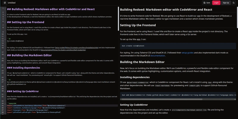
Here's how the Markdown editor looks in action
Here's how far we've progressed in Redoed up to this point: GitHub - ui-md-editor branch