


![[The AI Show Episode 142]: ChatGPT’s New Image Generator, Studio Ghibli Craze and Backlash, Gemini 2.5, OpenAI Academy, 4o Updates, Vibe Marketing & xAI Acquires X](https://www.marketingaiinstitute.com/hubfs/ep%20142%20cover.png)


![From drop-out to software architect with Jason Lengstorf [Podcast #167]](https://cdn.hashnode.com/res/hashnode/image/upload/v1743796461357/f3d19cd7-e6f5-4d7c-8bfc-eb974bc8da68.png?#)


.png?#)


_Christophe_Coat_Alamy.jpg?#)
 (1).webp?#)


![Apple Considers Delaying Smart Home Hub Until 2026 [Gurman]](https://www.iclarified.com/images/news/96946/96946/96946-640.jpg)
![iPhone 17 Pro Won't Feature Two-Toned Back [Gurman]](https://www.iclarified.com/images/news/96944/96944/96944-640.jpg)
![Tariffs Threaten Apple's $999 iPhone Price Point in the U.S. [Gurman]](https://www.iclarified.com/images/news/96943/96943/96943-640.jpg)


PREDICTION OF GLOBAL RESTAURANT RATINGS WITH MACHINE LEARNING
PROJECT INTRODUCTION The rating of a restaurant is an important form of feedback given to the restaurant to provide either appraisal or criticism about the restaurant's services. This is a regression analysis project, the main aim of this project is to understand the dataset and carefully handle missing values, perform Exploratory Data Analysis(EDA), perform feature engineering, and create machine learning models such as the Linear Regression, Decision Tree Regression, Random Forest Regression models to help predict the rating of each restaurants. DATASET OVERVIEW The dataset is obtained from (https://raw.githubusercontent.com/Oyeniran20/axia_class_cohort_7/refs/heads/main/Dataset%20.csv). Import Required Libraries #importing the required libraries. import pandas as pd import numpy as np import matplotlib.pyplot as plt import seaborn as sns import plotly.express as px %matplotlib inline sns.set_style('whitegrid') Load The Dataset #load the dataset df = pd.read_csv('https://raw.githubusercontent.com/Oyeniran20/axia_class_cohort_7/refs/heads/main/Dataset%20.csv') df.head() Get Dataset Information #Get information of the dataset df.info() The restaurant dataset contains 21 columns and 9551 rows. The columns are explained below with their importance; Restaurant ID and Restaurant Name are two columns that provide information about each restaurant’s name and ID. The Country Code, City, Address, Locality, Locality Verbose, Longitude, and Latitude provide specific location and indigenous information about each restaurant. Cuisines provides information about each type of cuisine offered in a restaurant. The range of prices, the average cost for two people, and the currency offer information about the type of money and amount of each dish, which are also key features in predicting the target variable. Rating color, text, and Votes provide information about each restaurant’s rating and are also key features in predicting the target variable. The aggregate rating, which is our target variable, is the rating each restaurant receives. Dataset Statistics #Check for the statistics of the dataset and Transpose df.describe().T Observation: We can notice outliers in the Average Cost for the two columns, the 25% is oddly larger than the 50%,75% and max. We can also notice outliers in the Votes column, the 25% is also oddly larger than the 50%,75% and max. DATA HANDLING We would check for missing values in this aspect and handle them accordingly. #check for missing data df.isna().sum().sort_values(ascending=False) Handling Missing Values #Drop the missing values df.dropna(inplace=True) Observation: We have just 9 missing values in the cuisine column; this is a very small percentage of missing values, so it's best we drop the missing values. Now that the dataset has been reviewed, we have seen the head of the dataset, we have gotten information to help us understand the dataset more, we have also handled missing values, the next thing to do is our Exploratory Data Analysis(EDA) EXPLORATORY DATA ANALYSIS In this aspect, we would perform a dataset exploration to help us better understand the dataset, and this part is more of visualizing the dataset to show relationships between different columns and the target variable, to also check for outliers and skewness with visualization. Let's get into it. Firstly, we would check the distribution of our target variable, which is the Aggregate rating column, using the histogram plot and the boxplot. #Histogram plt.figure(figsize=(10,6)) plt.subplot(1,2,1) sns.histplot(df['Aggregate rating'], kde=True, bins=20,color='lightgreen') plt.title('Aggregate Rating Distribution') plt.xlabel('Aggregate Rating') #Boxplot plt.subplot(1,2,2) sns.boxplot(x='Aggregate rating', data=df, color='lightblue') plt.title('Aggregate Rating Boxplot') plt.xlabel('Aggregate Rating') plt.show() Observation: From the results obtained from the frequency count of the Aggregate rating by the Rating text, it can be seen that 0 appeared 2148 times as not-rated restaurants. From the histogram, it can be deduced that the Aggregate rating is negatively skewed. From the boxplot, it can be noticed that 0 is the only outlier in the plot. Next, we would identify the top 5 cuisines and the top cities. Top 5 cuisines #Visualize the Top5 cuisines top_cuisines = df['Cuisines'].dropna().str.split(', ').explode().value_counts().head(5) plt.figure(figsize=(10,6)) plot = sns.barplot(top_cuisines, color='lightgreen') for bars in plot.containers: plot.bar_label(bars) plt.title('Top 5 Cuisines') plt.show() Top 5 cities #Visualize the Top5 cuisines plt.figure(figsize=(10,6)) plot = sns.countplot(x='City', data=df, order=df['City'].value_counts().index[:5],color='lightgreen') for bars in plot.containers: plot.bar_label(bars) plt.title('Top 5 Cities') plt.xlabel('Cities') plt.show()

PROJECT INTRODUCTION
The rating of a restaurant is an important form of feedback given to the restaurant to provide either appraisal or criticism about the restaurant's services. This is a regression analysis project, the main aim of this project is to understand the dataset and carefully handle missing values, perform Exploratory Data Analysis(EDA), perform feature engineering, and create machine learning models such as the Linear Regression, Decision Tree Regression, Random Forest Regression models to help predict the rating of each restaurants.
DATASET OVERVIEW
The dataset is obtained from (https://raw.githubusercontent.com/Oyeniran20/axia_class_cohort_7/refs/heads/main/Dataset%20.csv).
Import Required Libraries
#importing the required libraries.

import pandas as pd
import numpy as np
import matplotlib.pyplot as plt
import seaborn as sns
import plotly.express as px

%matplotlib inline

sns.set_style('whitegrid')
Load The Dataset
#load the dataset
df = pd.read_csv('https://raw.githubusercontent.com/Oyeniran20/axia_class_cohort_7/refs/heads/main/Dataset%20.csv')
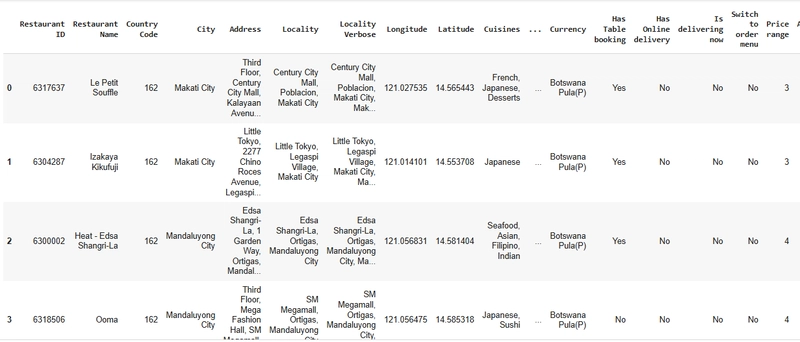
df.head()
Get Dataset Information
#Get information of the dataset

df.info()
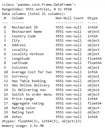
The restaurant dataset contains 21 columns and 9551 rows. The columns are explained below with their importance;
Restaurant ID and Restaurant Name are two columns that provide information about each restaurant’s name and ID.
The Country Code, City, Address, Locality, Locality Verbose, Longitude, and Latitude provide specific location and indigenous information about each restaurant.
Cuisines provides information about each type of cuisine offered in a restaurant.
The range of prices, the average cost for two people, and the currency offer information about the type of money and amount of each dish, which are also key features in predicting the target variable.
Rating color, text, and Votes provide information about each restaurant’s rating and are also key features in predicting the target variable.
The aggregate rating, which is our target variable, is the rating each restaurant receives.
Dataset Statistics
#Check for the statistics of the dataset and Transpose

df.describe().T
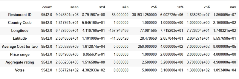
Observation:
We can notice outliers in the Average Cost for the two columns, the 25% is oddly larger than the 50%,75% and max.
We can also notice outliers in the Votes column, the 25% is also oddly larger than the 50%,75% and max.
DATA HANDLING
We would check for missing values in this aspect and handle them accordingly.
#check for missing data

df.isna().sum().sort_values(ascending=False)
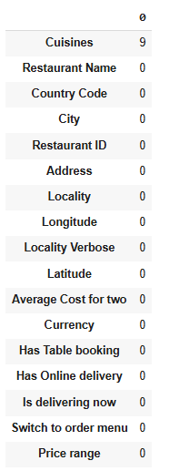
Handling Missing Values
#Drop the missing values

df.dropna(inplace=True)
Observation:
- We have just 9 missing values in the cuisine column; this is a very small percentage of missing values, so it's best we drop the missing values.
Now that the dataset has been reviewed, we have seen the head of the dataset, we have gotten information to help us understand the dataset more, we have also handled missing values, the next thing to do is our Exploratory Data Analysis(EDA)
EXPLORATORY DATA ANALYSIS
In this aspect, we would perform a dataset exploration to help us better understand the dataset, and this part is more of visualizing the dataset to show relationships between different columns and the target variable, to also check for outliers and skewness with visualization.
Let's get into it.
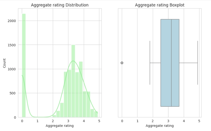
Firstly, we would check the distribution of our target variable, which is the Aggregate rating column, using the histogram plot and the boxplot.
#Histogram
plt.figure(figsize=(10,6))
plt.subplot(1,2,1)
sns.histplot(df['Aggregate rating'], kde=True, bins=20,color='lightgreen')
plt.title('Aggregate Rating Distribution')
plt.xlabel('Aggregate Rating')

#Boxplot
plt.subplot(1,2,2)
sns.boxplot(x='Aggregate rating', data=df, color='lightblue')
plt.title('Aggregate Rating Boxplot')
plt.xlabel('Aggregate Rating')

plt.show()
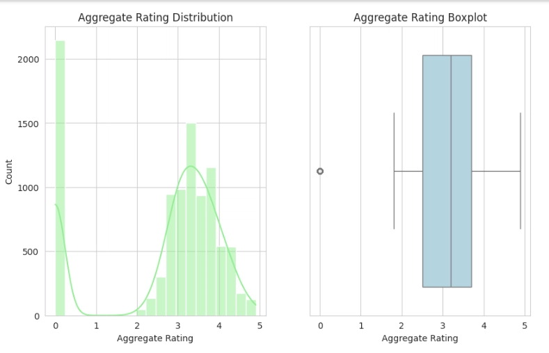
Observation:
- From the results obtained from the frequency count of the Aggregate rating by the Rating text, it can be seen that 0 appeared 2148 times as not-rated restaurants.
- From the histogram, it can be deduced that the Aggregate rating is negatively skewed.
- From the boxplot, it can be noticed that 0 is the only outlier in the plot.
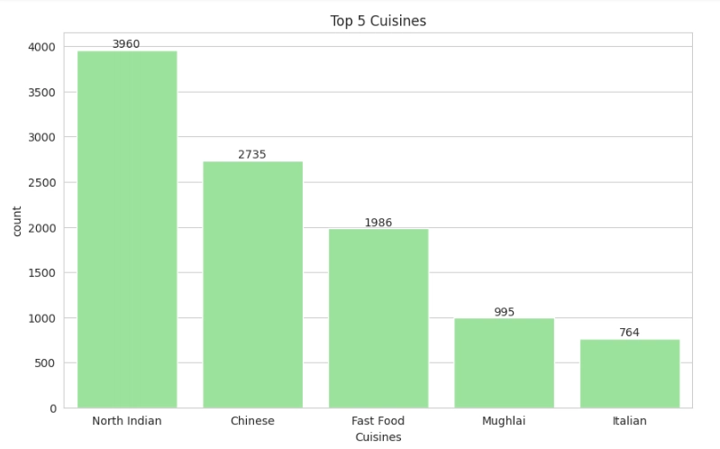
Next, we would identify the top 5 cuisines and the top cities.
Top 5 cuisines
#Visualize the Top5 cuisines
top_cuisines = df['Cuisines'].dropna().str.split(', ').explode().value_counts().head(5)
plt.figure(figsize=(10,6))
plot = sns.barplot(top_cuisines, color='lightgreen')
for bars in plot.containers:
    plot.bar_label(bars)
plt.title('Top 5 Cuisines')
plt.show()
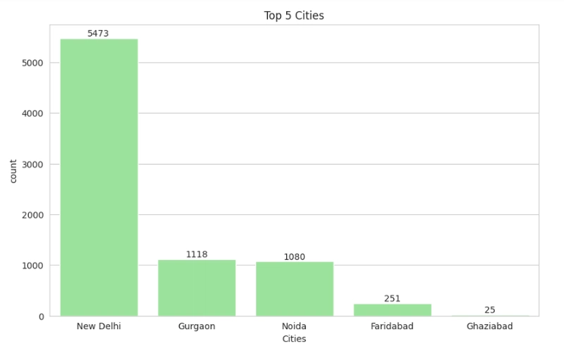
Top 5 cities
#Visualize the Top5 cuisines
plt.figure(figsize=(10,6))
plot = sns.countplot(x='City', data=df, order=df['City'].value_counts().index[:5],color='lightgreen')
for bars in plot.containers:
  plot.bar_label(bars)
plt.title('Top 5 Cities')
plt.xlabel('Cities')
plt.show()
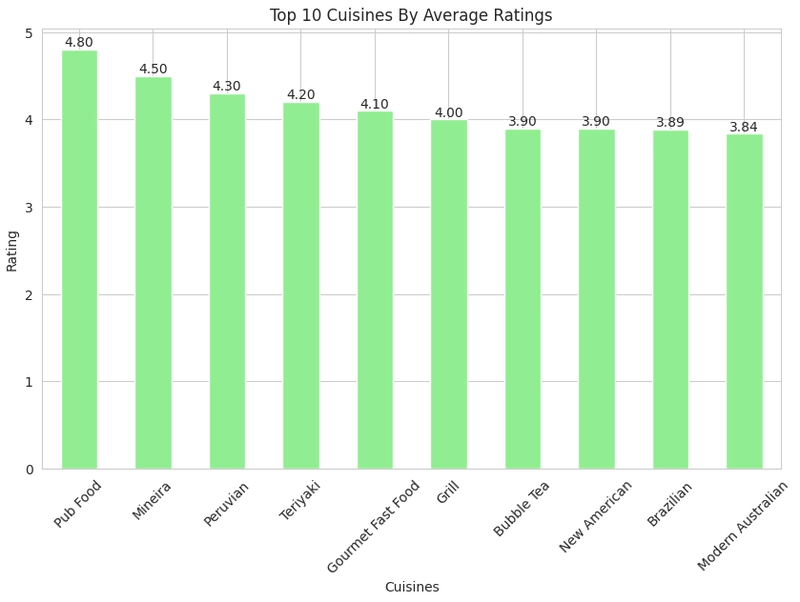
Next, we would compare average ratings across cuisines and cities;
Average rating across cuisines
#Compare Average rating across cuisines

#split cuisines
df["Cuisines"] = df["Cuisines"].str.split(", ").explode().reset_index(drop=True)

plt.figure(figsize=(10,6))
plot = df.groupby('Cuisines')['Aggregate rating'].mean().sort_values(ascending=False).head(10).plot(kind='bar',color='lightgreen')
for bars in plot.containers:
  plot.bar_label(bars, fmt='%.2f')
plt.xlabel('Cuisines')
plt.ylabel('Rating')
plt.title('Top 10 Cuisines By Average Ratings')
plt.xticks(rotation=45)
plt.show()
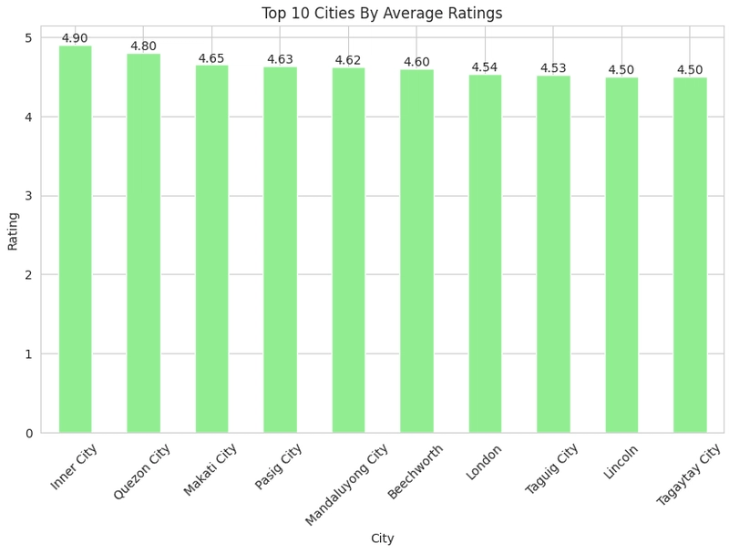
Average rating across cities
#Compare Average rating across cities

plot = df.groupby('City')['Aggregate rating'].mean().sort_values(ascending=False).head(10).plot(kind='bar',color='lightgreen')
for bars in plot.containers:
  plot.bar_label(bars,  fmt='%.2f')
plt.xlabel('City')
plt.ylabel('Rating')
plt.title('Top 10 Cities By Average Ratings')
plt.show()
Alright, that looks cool. Our next visualization would be our geospatial Analysis.
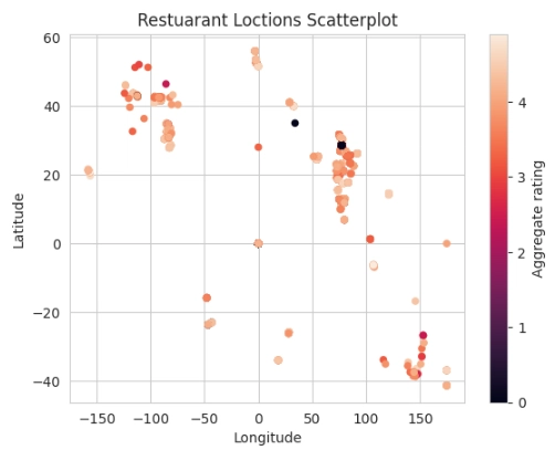
Geospatial Analysis
In this visualization step, we would display a map using our latitude and longitude columns.
Firstly, we would display it using a scatterplot to show a simple representation.
#Scatterplot

df.plot(x='Longitude', y='Latitude',c='Aggregate rating',kind='scatter')
plt.title('Restuarant Loctions Scatterplot')
plt.show()
Next, we would use the plotly library to display the map,
#Plotly

fig = px.scatter_mapbox(df,
                        lon='Longitude',
                        lat='Latitude',
                        zoom = 2,
                        color ='Aggregate rating',
                        width = 1200,
                        height = 900,
                        title= ('Global Restaurants Location with Rating')
                        )
fig.update_layout(mapbox_style = 'open-street-map')
fig.update_layout(margin = {'r':0, 't':50, 'l':0, 'b':10})
fig.show()
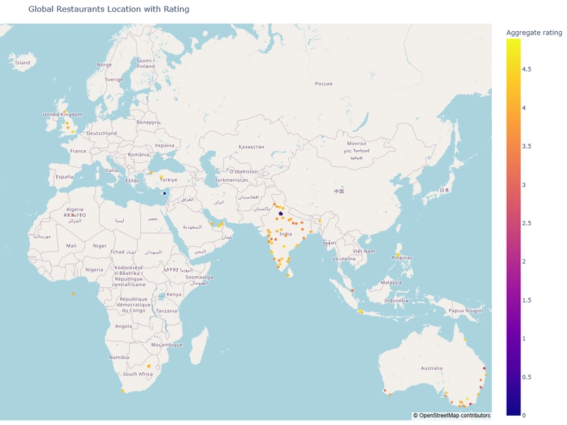
Observation:
- It can be seen from the map that the restaurants are located all over the world.
We would do more data visualizations to gain extra insights and understanding.
Check for Outliers and Skewness
In this aspect, we would check for outliers using the boxplot and the skewness using the histogram.
#Get the numerical columns

num_col = ['Average Cost for two','Price range','Aggregate rating','Votes']

#Check for outliers using both histplot and boxplot

#histogram
for col in num_col:
  plt.figure(figsize=(10,6))
  plt.subplot(1,2,1)
  sns.histplot(df[col], kde=True, bins=20,color='lightgreen')
  plt.title(f'{col} Distribution')
  plt.xlabel(col)

  #Boxplot
  plt.subplot(1,2,2)
  sns.boxplot(x= df[col], data=df, color='lightblue')
  plt.title(f'{col} Boxplot')
  plt.xlabel(col)

plt.show()
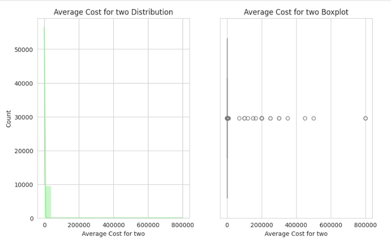
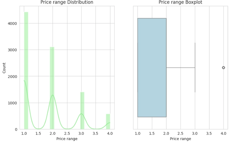
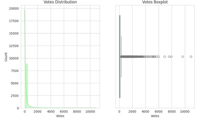
Observation:
- Skewness and Outliers can be seen throughout the histogram and boxplot, respectively.
- The Average cost for two, Price range and Votes plot each show a positively skewed distribution; they all display outliers also in their boxplots.
- The Aggregate rating plot shows a negatively skewed distribution, and it shows only one particular outlier in the box plots.
- It can be resolved either by performing the Log or Sqrt transformation on the affected columns, as it would be necessary when preparing data for model training.
After checking for outliers and skewness, we would do a few more data visualizations to better understand the relationships between more columns and the target variable.
Determine the relationship between votes and ratings
#Show relationship between the Votes and Aggregate rating using Scatterplot

df.plot(x='Votes', y='Aggregate rating', kind='scatter', color='lightgreen')
plt.show()
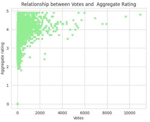
Observation:
From the scatterplot:
- It can be noticed that the 0, which is represented as Not rated restaurants, has 0 votes also.
- It can be noticed that the majority of the Votes are between the 3, 4 and 5 Aggregate ratings, while a minority fall between the 2 and 3 Aggregate ratings, and lastly, no votes fall between the 0 and 1 Aggregate ratings at all.
- It can be noticed that the majority of the Aggregate rating falls between 0 to 2000 votes, while a minority of the Aggregate rating falls between 2000 to 4000 votes.
- It can be noticed that some extreme values are present between 6000 to 10000, which might be indication of possible outliers.
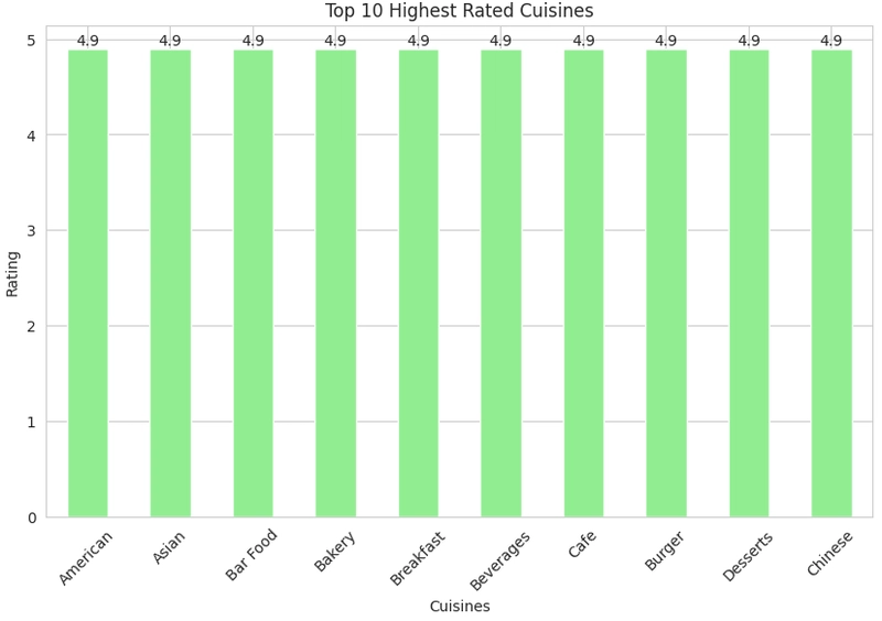
Identify the highest-rated cuisines
In this aspect, we would visualize the highest-rated cuisines in the dataset using a bar plot.
#Identify highest-rated cuisines


plt.figure(figsize=(10,6))
plot = df.groupby('Cuisines')['Aggregate rating'].max().sort_values(ascending=False).head(10).plot(kind='bar', color='lightgreen')
for bars in plot.containers:
  plot.bar_label(bars)
plt.title('Top 10 Highest Rated Cuisines')
plt.xlabel('Cuisines')
plt.ylabel('Rating')
plt.xticks(rotation=45)
plt.show()
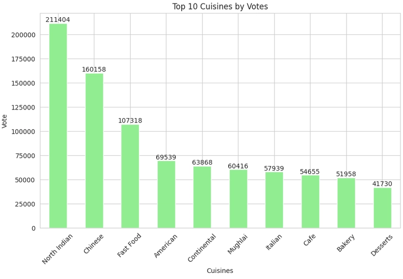
Identify popular cuisines by votes
In this aspect, we would visualize cuisines with the highest votes.
#Identify Popular cuisines by votes


plt.figure(figsize=(10,6))
plot = df.groupby('Cuisines')['Votes'].sum().sort_values(ascending=False).head(10).plot(kind='bar', color='lightgreen')
for bars in plot.containers:
  plot.bar_label(bars)
plt.title('Top 10 Cuisines by Votes')
plt.xlabel('Cuisines')
plt.ylabel('Vote')
plt.xticks(rotation=45)
plt.show()
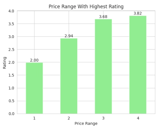
Determine which price ranges receive the highest ratings
In this aspect, we would visualize the price ranges that have the highest ratings using a bar plot.
#Price range with highest ratings

plot = df.groupby('Price range')['Aggregate rating'].mean().plot(kind='bar', color='lightgreen')
for bars in plot.containers:
  plot.bar_label(bars,  fmt='%.2f')
plt.title('Price Range With Highest Rating')
plt.xlabel('Price Range')
plt.ylabel('Rating')
plt.xticks(rotation=0)
plt.show()
Compare restaurants with and without table booking with Aggregate ratings
In this aspect, we would visualize the comparison of the restaurants with or without table bookings with aggregate ratings.
#Compare Restaurants that Has Table booking by ratings

plot = df.groupby('Has Table booking')['Aggregate rating'].mean().plot(kind='bar', color='lightgreen')
for bars in plot.containers:
  plot.bar_label(bars,  fmt='%.2f')
plt.title('Has Table Booking By Average Rating')
plt.xlabel('Has Table Booking')
plt.xticks(rotation=0)
plt.ylabel('Rating')
plt.show()
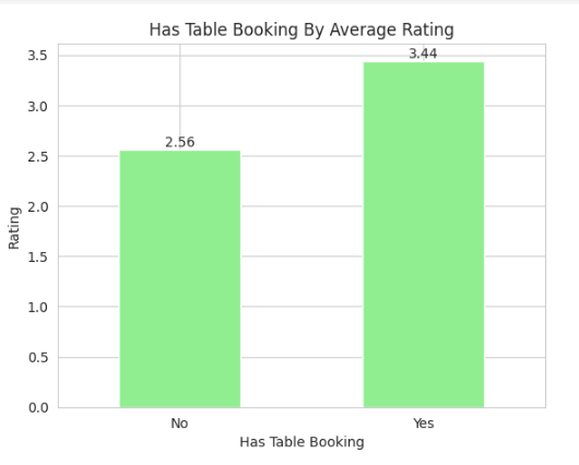
Observation:
- We can also observe that restaurants that provide the Has Table Booking option tend to have higher ratings than restaurants that do not provide the Has Table Booking option.
Lastly, in our EDA section, we would check the Online delivery column for insights also.
Calculate the percentage of restaurants offering delivery
#percentage of restuarants offering online delivery

restuarant_delivery = round((len(df[df['Has Online delivery'] == 'Yes'])/len(df['Has Online delivery']))*100,2)

print(f'The percentage of restuarants offering Online Delivery is : {restuarant_delivery}%')
Output:
The percentage of restaurants offering Online Delivery is 25.69%
Observation:
The result indicates that 25.69% of restaurants provide online delivery.
Analyze availability across different price ranges
#Analyze the availability of online delivery among restaurants with different price ranges.


df.groupby('Has Online delivery')['Price range'].value_counts()
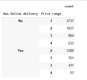
Observation:
- We noticed that restaurants with a lower price range do not provide Online Delivery services, while restaurants with a higher price range do provide Online Delivery services.
Feature Engineering
In the feature engineering aspect, I would create encoded categorical columns of the Has Table Booking, Has Online Delivery, and Is Delivering Now columns by using the pd.get_dummies function. It can also be done by using the scikit-learn function, which is the One-Hot Encoder, but as said earlier, I would be using the Pd.get_dummies to carry it out.
#Encoding the categorical columns

df['Has Table booking'] = pd.get_dummies(df['Has Table booking'], drop_first=True, dtype=float)
df['Has Online delivery'] = pd.get_dummies(df['Has Online delivery'], drop_first=True, dtype=float)
df['Is delivering now'] = pd.get_dummies(df['Is delivering now'], drop_first=True, dtype=float)

df.head(5)
Observation:
- 1 is Yes, 0 is No
Handling of Skewness
In this aspect, I would handle the skewed data by using both the sqrt and log1p transformations to handle the skewness, and compare which transformation performed well in handling the skewness and use it in our model training. The log1p is used because it helps in handling zeros in the column about to be transformed.
Using the Sqrt Transformation
#Using the sqrt transformation

df['sqrt_Average_Cost_for_two'] = np.sqrt(df['Average Cost for two'])
df['sqrt_votes'] = np.sqrt(df['Votes'])
df['sqrt_Aggregate_rating'] = np.sqrt(df['Aggregate rating'])
Using The Log1p Transformation
#Using the log1p transformation

df['log1p_Average_Cost_for_two'] = np.log1p(df['Average Cost for two'])
df['log1p_votes'] = np.log1p(df['Votes'])
df['log1p_Aggregate_rating'] = np.log1p(df['Aggregate rating'])
Observation:
- After using the sqrt and log1p transformations, it can be noticed from the visualizations that the log1p performed better on the Votes and Average cost for two columns.
- The log1p was used instead of the regular log because it helps in treating zero values in the dataset.
- Only the log1p_votes and log1p_Average_cost_for_two would be used in our model training.
- There is no significant change in the Aggregate rating after using both the sqrt and log1p transformations, so we would just make use of the normal Aggregate column.
- The Price range was not transformed at all because no significant outliers were being visualized.
Data Preparation
In this aspect, I would first split the data into the Independent variable(X) and the target variable (y)
#Split into X[Features] and y[Target variable]

X = df.drop(['Restaurant ID', 'Restaurant Name', 'Country Code', 'City', 'Address',
             'Locality', 'Locality Verbose', 'Longitude', 'Latitude', 'Cuisines','Currency','Switch to order menu',
             'Average Cost for two','sqrt_Average_Cost_for_two','Votes','Rating color', 'Rating text',
             'sqrt_votes', 'sqrt_Aggregate_rating','log1p_Aggregate_rating','Aggregate rating'], axis=1)
y = df['Aggregate rating']
Then, I would split the dataset into train and test splits using the scikit-learn TrainTestSplit.
#split the data into train and test

#import reqired library
from sklearn.model_selection import train_test_split,GridSearchCV

X_train, X_test, y_train, y_test = train_test_split(X, y, test_size=0.2, random_state=42)
Observation:
- The dataset was split into Features [X] and Target[y] variable
- It was then split into our Train and Test splits using TestTrainSplit.
- The dataset was split into 80% train data and 20% test data.
Model Selection and Evaluation
We used three models for this prediction project, models used are:
- Linear Regression: A simple regression model for prediction.
- Decision Tree Regression: It uses a tree-like model to predict continuous numerical values by recursively splitting data based on features, ultimately leading to a prediction at the leaf nodes.
- Random Forest Regression: It predicts continuous values by averaging the predictions of multiple, independently trained decision trees, each trained on a random subset of the data.
Linear Regression
#build the linear regression model
#import required library
from sklearn.linear_model import LinearRegression

lr = LinearRegression()

lr.fit(X_train,y_train)

#predict the train and test data
train_pred = lr.predict(X_train)
test_pred = lr.predict(X_test)
Evaluation of the Model;
#Evaluating the metrics of the Linear regression model

from sklearn.metrics import mean_squared_error, root_mean_squared_error, r2_score


#the mean square error for the Train and Test data

lr_train_mse = mean_squared_error(y_train,train_pred)
print(f'Training MSE: {lr_train_mse}')
print('\n')
lr_test_mse = mean_squared_error(y_test,test_pred)
print(f'Test MSE: {lr_test_mse} ')
print('\n')


#the root mean square error for the Train and Test data

lr_train_rmse = root_mean_squared_error(y_train,train_pred)
print(f'Training RMSE: {lr_train_rmse}')
print('\n')
lr_test_rmse = root_mean_squared_error(y_test,test_pred)
print(f'Test RMSE: {lr_test_rmse} ')
print('\n')


#the r2 score of the Train and Test data

lr_train_score = r2_score(y_train,train_pred)
print(f'Training SCORE: {lr_train_score}')
print('\n')
lr_test_score = r2_score(y_test,test_pred)
print(f'Test SCORE: {lr_test_score} ')
print('\n')
`Training MSE: 0.6387975061881729
Test MSE: 0.6360581133977781
Training RMSE: 0.7992480880103329
Test RMSE: 0.797532515573991
Training SCORE: 0.7225277903282395
Test SCORE: 0.7222492709572614`
Observation:
The results obtained from the Linear Regression model suggest that the model might not be capturing the data’s complexity well.
MSE (Mean Squared Error)
- Training MSE: 0.6387
- Test MSE: 0.6360
- MSE is nearly the same for training and test sets, indicating no overfitting.
- Lower MSE means the model’s predictions are relatively close to actual values
RMSE (Root Mean Squared Error)
- Training RMSE: 0.7992
- Test RMSE: 0.7975
- RMSE is lower than the standard deviation, meaning the model improves upon a naive prediction (e.g., using the mean).
R² Score
- Training R²: 0.7225
- Test R²: 0.7222
- A low R² (~0.72) means that the model explains 72% of the variance in the target variable.
The small gap between training and test R² suggests that the model generalizes well to unseen data.
Decision Tree Regression
Build the model for prediction. This is a decision tree model, we would make use of hyperparameters to fine-tune the model to prevent it from overfitting and get the best estimators to help our model predict well.
#Build Decision Tree Model
#import required library
from sklearn.tree import DecisionTreeRegressor
from sklearn.model_selection import GridSearchCV
#Define the parameter grid
param_gr = {
    'max_depth': [3, 5, 10, None],
    'min_samples_split': [2, 5, 10],
    'min_samples_leaf': [1, 2, 5],
}


#model

dtree = DecisionTreeRegressor()

#Grid search

grid_search = GridSearchCV(estimator=dtree, param_grid=param_gr, n_jobs=-1)
grid_search.fit(X_train, y_train)
After building the model and fine-tuning with hyperparameters, we would get the best estimator, which would be used in training our model.
#best estimator
best_gri= grid_search.best_estimator_

#Predict the train and test using the best estimator
d_train_pred = best_gri.predict(X_train)
d_test_pred = best_gri.predict(X_test)
Evaluation of the model.
#Evaluating the metrics of the Decision Tree regression model

from sklearn.metrics import mean_squared_error, root_mean_squared_error, r2_score


#the mean square error for the Train and Test data

d_train_mse = mean_squared_error(y_train,d_train_pred)
print(f'Training MSE: {d_train_mse}')
print('\n')
d_test_mse = mean_squared_error(y_test,d_test_pred)
print(f'Test MSE: {d_test_mse} ')
print('\n')


#the root mean square error for the Train and Test data

d_train_rmse = root_mean_squared_error(y_train,d_train_pred)
print(f'Training RMSE: {d_train_rmse}')
print('\n')
d_test_rmse = root_mean_squared_error(y_test,d_test_pred)
print(f'Test RMSE: {d_test_rmse} ')
print('\n')


#the r2 score of the Train and Test data

d_train_score = r2_score(y_train,d_train_pred)
print(f'Training SCORE: {d_train_score}')
print('\n')
d_test_score = r2_score(y_test,d_test_pred)
print(f'Test SCORE: {d_test_score} ')
print('\n')
`Training MSE: 0.09720034928562282
Test MSE: 0.1265090432569965
Training RMSE: 0.3117697055289735
Test RMSE: 0.35568109769426387
Training SCORE: 0.9577794286360224
Test SCORE: 0.9447566531186506
`
Observation:
Decision Tree Regression results show a significant improvement over Linear Regression!
MSE (Mean Squared Error)
- Training MSE: 0.0972
- Test MSE: 0.1265
- Drastic improvement from the previous MSE of 0.638 (Linear Regression).
- Slightly Higher Test Error than Training
RMSE (Root Mean Squared Error)
- Training RMSE: 0.3117
- Test RMSE: 0.3556
- Huge improvement from the previous RMSE of 0.7992.
- RMSE is way lower than the standard deviation, meaning much better predictions.
- The average prediction error is small.
- Train-test RMSEs are nearly identical, indicating excellent generalization.
- Predictions are more accurate than before.
R² Score (Model Fit)
- Training R²: 0.9577
- Test R²: 0.9447
- The model ~94% of variance captures almost all the variance in the target variable.
- It is performing much better than Linear Regression (which had ~0.72 R²).
- Decision Tree is outperforming Linear Regression (MSE, RMSE, and R² all improved).
- No overfitting, as train and test R² are nearly equal.
- A better model than the Linear Regression model.
Random Forest Regression
Build the model for prediction. This is a random forest model, we would make use of hyperparameters to fine-tune the model to prevent it from overfitting and get the best estimators to help our model predict well.
from sklearn.ensemble import RandomForestRegressor

# Define the parameter grid
param_grid = {
    'max_depth': [5, 10, 15, None],
    'n_estimators':[2,5,10]
}

#model

forest = RandomForestRegressor(random_state=42)

grid_search = GridSearchCV(forest, param_grid, n_jobs=-1)
grid_search.fit(X_train, y_train)
After building the model and fine-tuning with hyperparameters, we would get the best estimator, which would be used in training our model.
#best estimator
best_grid= grid_search.best_estimator_

#Predict the train and test using the best estimator
r_train_pred = best_grid.predict(X_train)
r_test_pred = best_grid.predict(X_test)
Evaluation of the model.
#Evaluating the metrics of the Random Forest regression model

from sklearn.metrics import mean_squared_error, root_mean_squared_error, r2_score


#the mean square error for the Train and Test data

r_train_mse = mean_squared_error(y_train,r_train_pred)
print(f'Training MSE: {r_train_mse}')
print('\n')
r_test_mse = mean_squared_error(y_test,r_test_pred)
print(f'Test MSE: {r_test_mse} ')
print('\n')


#the root mean square error for the Train and Test data

r_train_rmse = root_mean_squared_error(y_train,r_train_pred)
print(f'Training RMSE: {r_train_rmse}')
print('\n')
r_test_rmse = root_mean_squared_error(y_test,r_test_pred)
print(f'Test RMSE: {r_test_rmse} ')
print('\n')


#the r2 score of the Train and Test data

r_train_score = r2_score(y_train,r_train_pred)
print(f'Training SCORE: {r_train_score}')
print('\n')
r_test_score = r2_score(y_test,r_test_pred)
print(f'Test SCORE: {r_test_score} ')
print('\n')
`Training MSE: 0.08600751284842134
Test MSE: 0.1142196278739341
Training RMSE: 0.2932703749928065
Test RMSE: 0.33796394463601304
Training SCORE: 0.9626412213459802
Test SCORE: 0.9501231345929935 `
Observation:
Random Forest Regression model has shown significant improvements compared to Decision Tree and Linear Regression.
MSE (Mean Squared Error)
- Training MSE: 0.0860
- Test MSE: 0.1142
- Test MSE decreased from 0.6360 → 0.1265 → 0.1142, meaning Random Forest generalizes better than Decision Tree and Linear Regression.
RMSE (Root Mean Squared Error)
- Training RMSE: 0.304
- Test RMSE: 0.328
- Test RMSE dropped from 0.7975 → 0.3556 → 0.3379, meaning Random Forest reduces error significantly.
- Training RMSE also improved, making the model more precise.
- Prediction errors are small, generalise well.
R² Score (Model Fit)
- Training R²: 0.9626
- Test R²: 0.9501
- Training R² increased from 0.7222 → 0.9447 → 0.9626, meaning Random Forest captures more variance.
- Test Score (0.9501) is close to Training Score (0.9626). This means no signs of overfitting, which is great.
- The model explains ~95% of the variance. Excellent fit.
KEY INSIGHTS
- Random Forest outperformed Decision Tree and Linear Regression in every metric (lower RMSE, lower MSE, higher R²).
- No signs of overfitting, as the train-test scores are close.
- Better generalization, since test performance improved significantly.
- Random Forest is the best-performing model so far.
- The Random Forest regression is saved using the pickle library, as it is the best-performing model.
Conclusion
In this article, using the Restaurant dataset, we have demonstrated an end-to-end machine learning project from beginning to end. Data cleaning and visualization were our first steps. Then, to give better data to train with the machine learning model, we had to encode our categorical data using the pd.get_dummies(Feature Engineering). After that, we tried to build three machine-learning models and evaluated them. Random Forest regression is the best-performing model compared with Decision Tree Regression and Linear Regression.
You can check out the GitHub file here: Raw File