


![[The AI Show Episode 142]: ChatGPT’s New Image Generator, Studio Ghibli Craze and Backlash, Gemini 2.5, OpenAI Academy, 4o Updates, Vibe Marketing & xAI Acquires X](https://www.marketingaiinstitute.com/hubfs/ep%20142%20cover.png)


![From drop-out to software architect with Jason Lengstorf [Podcast #167]](https://cdn.hashnode.com/res/hashnode/image/upload/v1743796461357/f3d19cd7-e6f5-4d7c-8bfc-eb974bc8da68.png?#)


.png?#)


_Christophe_Coat_Alamy.jpg?#)


.webp?#)
 (1).webp?#)


![Apple Considers Delaying Smart Home Hub Until 2026 [Gurman]](https://www.iclarified.com/images/news/96946/96946/96946-640.jpg)
![iPhone 17 Pro Won't Feature Two-Toned Back [Gurman]](https://www.iclarified.com/images/news/96944/96944/96944-640.jpg)
![Tariffs Threaten Apple's $999 iPhone Price Point in the U.S. [Gurman]](https://www.iclarified.com/images/news/96943/96943/96943-640.jpg)


Netflix Data Visualization using Amazon QuickSight
As data becomes increasingly central to business decisions, the ability to create compelling visualizations is more valuable than ever. In this guide, I’ll walk you through my recent experience with Amazon QuickSight, AWS’s cloud-based business intelligence service, using Netflix content data as an example. What is Amazon QuickSight? Amazon QuickSight is a powerful cloud-based business intelligence service that enables users to create and share interactive dashboards and reports. What makes it particularly attractive is its seamless integration with AWS services and its scalability. Whether you’re analyzing a small dataset or working with enterprise-level data, QuickSight can handle it while maintaining the ease of use that’s crucial for both beginners and experienced analysts. Project Setup: Getting Started with QuickSight 1. Setting Up Your Environment The first step was creating a QuickSight account, which comes with a 30-day free trial. The setup process took about 5 minutes, including the necessary step of enabling access to my S3 bucket. 2. Data Preparation For this project, I worked with two key files: netflix_titles.csv: The main dataset containing Netflix content information manifest.json: A configuration file that tells QuickSight where to find and how to read the data One important lesson learned: The manifest.json file plays a crucial role in connecting QuickSight to your data. It’s essential to ensure your S3 URI is correctly specified in this file, as an outdated or incorrect URI can prevent access to your data. 3. Connecting to Your Data Source After setting up the S3 bucket, the next step was connecting it to QuickSight. This is done through the Datasets section in QuickSight. Creating Visualizations: A Step-by-Step Guide First Visualization: Release Year Distribution My first visualization was a donut chart showing the distribution of Netflix content across release years. Here’s how I created it: Selected the donut chart type from the Visuals menu Dragged the release_year field to the category section The resulting chart provided a clear breakdown of content distribution across the top 20 release years Using Filters Effectively One of the most valuable features I discovered was filtering. For my second visualization, I created a filtered view showing the count of TV shows and movies in specific categories. The key learning here was that filters help narrow down data to focus on specific aspects, making your visualizations more meaningful and easier to understand. Building the Final Dashboard The final step was combining these visualizations into a cohesive dashboard. Here are some best practices I followed: Edited graph titles to clearly communicate the purpose of each visualization Arranged visualizations logically to tell a story with the data Used the export function to save the dashboard as a PDF for sharing Unexpected Challenges and Learnings While QuickSight is generally user-friendly, I did encounter some navigation challenges. The interface took some time to get familiar with, but once I understood the basic workflow, creating visualizations became much more intuitive. The entire project took approximately 2 hours to complete, including: Initial setup Data preparation Creating visualizations Dashboard assembly Final adjustments Tips for Success Based on my experience, here are some key tips for working with QuickSight: Ensure your data source connections are properly configured before starting Take time to understand the relationship between your data fields Use filters strategically to focus on the most relevant data Pay attention to chart titles and labels for clarity Save your work frequently Conclusion Amazon QuickSight proves to be a valuable tool for data visualization, especially for those already working within the AWS ecosystem. While there is a learning curve, the platform’s capabilities make it worth the initial investment of time. The ability to quickly create interactive dashboards, combined with the scalability of AWS, makes QuickSight a strong contender in the business intelligence space. Whether you’re a data analyst, business professional, or just getting started with data visualization, QuickSight offers the tools needed to transform raw data into meaningful insights. Have you used Amazon QuickSight or other visualization tools? I’d love to hear about your experiences in the comments below.
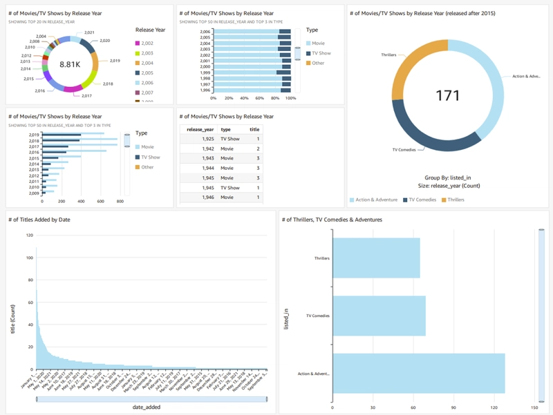
As data becomes increasingly central to business decisions, the ability to create compelling visualizations is more valuable than ever. In this guide, I’ll walk you through my recent experience with Amazon QuickSight, AWS’s cloud-based business intelligence service, using Netflix content data as an example.
What is Amazon QuickSight?
Amazon QuickSight is a powerful cloud-based business intelligence service that enables users to create and share interactive dashboards and reports. What makes it particularly attractive is its seamless integration with AWS services and its scalability. Whether you’re analyzing a small dataset or working with enterprise-level data, QuickSight can handle it while maintaining the ease of use that’s crucial for both beginners and experienced analysts.
Project Setup: Getting Started with QuickSight
1. Setting Up Your Environment
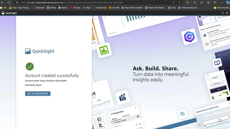
The first step was creating a QuickSight account, which comes with a 30-day free trial. The setup process took about 5 minutes, including the necessary step of enabling access to my S3 bucket.
2. Data Preparation
For this project, I worked with two key files:
netflix_titles.csv: The main dataset containing Netflix content information
manifest.json: A configuration file that tells QuickSight where to find and how to read the data
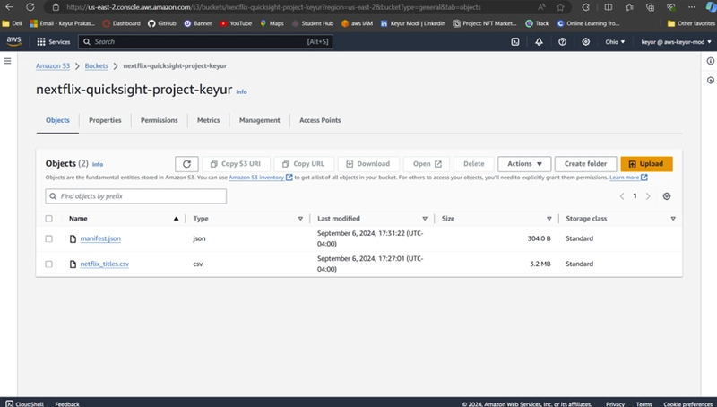
One important lesson learned: The manifest.json file plays a crucial role in connecting QuickSight to your data. It’s essential to ensure your S3 URI is correctly specified in this file, as an outdated or incorrect URI can prevent access to your data.
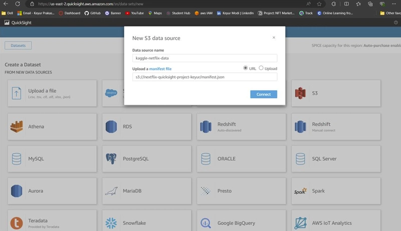
3. Connecting to Your Data Source
After setting up the S3 bucket, the next step was connecting it to QuickSight. This is done through the Datasets section in QuickSight.
Creating Visualizations: A Step-by-Step Guide
First Visualization: Release Year Distribution
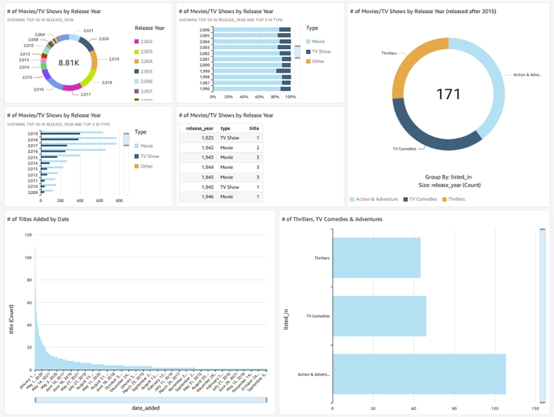
My first visualization was a donut chart showing the distribution of Netflix content across release years.
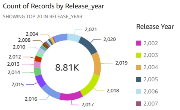
Here’s how I created it:
Selected the donut chart type from the Visuals menu
Dragged the release_year field to the category section
The resulting chart provided a clear breakdown of content distribution across the top 20 release years
Using Filters Effectively
One of the most valuable features I discovered was filtering. For my second visualization, I created a filtered view showing the count of TV shows and movies in specific categories.
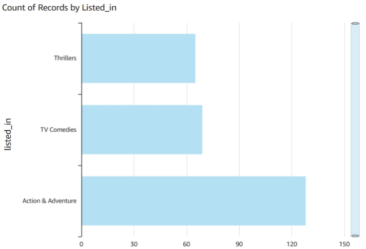
The key learning here was that filters help narrow down data to focus on specific aspects, making your visualizations more meaningful and easier to understand.
Building the Final Dashboard
The final step was combining these visualizations into a cohesive dashboard. Here are some best practices I followed:
Edited graph titles to clearly communicate the purpose of each visualization
Arranged visualizations logically to tell a story with the data
Used the export function to save the dashboard as a PDF for sharing
Unexpected Challenges and Learnings
While QuickSight is generally user-friendly, I did encounter some navigation challenges. The interface took some time to get familiar with, but once I understood the basic workflow, creating visualizations became much more intuitive.
The entire project took approximately 2 hours to complete, including:
Initial setup
Data preparation
Creating visualizations
Dashboard assembly
Final adjustments
Tips for Success
Based on my experience, here are some key tips for working with QuickSight:
Ensure your data source connections are properly configured before starting
Take time to understand the relationship between your data fields
Use filters strategically to focus on the most relevant data
Pay attention to chart titles and labels for clarity
Save your work frequently
Conclusion
Amazon QuickSight proves to be a valuable tool for data visualization, especially for those already working within the AWS ecosystem. While there is a learning curve, the platform’s capabilities make it worth the initial investment of time.
The ability to quickly create interactive dashboards, combined with the scalability of AWS, makes QuickSight a strong contender in the business intelligence space. Whether you’re a data analyst, business professional, or just getting started with data visualization, QuickSight offers the tools needed to transform raw data into meaningful insights.
Have you used Amazon QuickSight or other visualization tools? I’d love to hear about your experiences in the comments below.