


![[The AI Show Episode 143]: ChatGPT Revenue Surge, New AGI Timelines, Amazon’s AI Agent, Claude for Education, Model Context Protocol & LLMs Pass the Turing Test](https://www.marketingaiinstitute.com/hubfs/ep%20143%20cover.png)


![[DEALS] Koofr Cloud Storage: Lifetime Subscription (1TB) (80% off) & Other Deals Up To 98% Off – Offers End Soon!](https://www.javacodegeeks.com/wp-content/uploads/2012/12/jcg-logo.jpg)


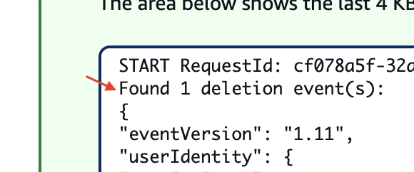
![Is this too much for a modular monolith system? [closed]](https://i.sstatic.net/pYL1nsfg.png)


_roibu_Alamy.jpg?width=1280&auto=webp&quality=80&disable=upscale#)


 CISO’s Core Focus.webp?#)


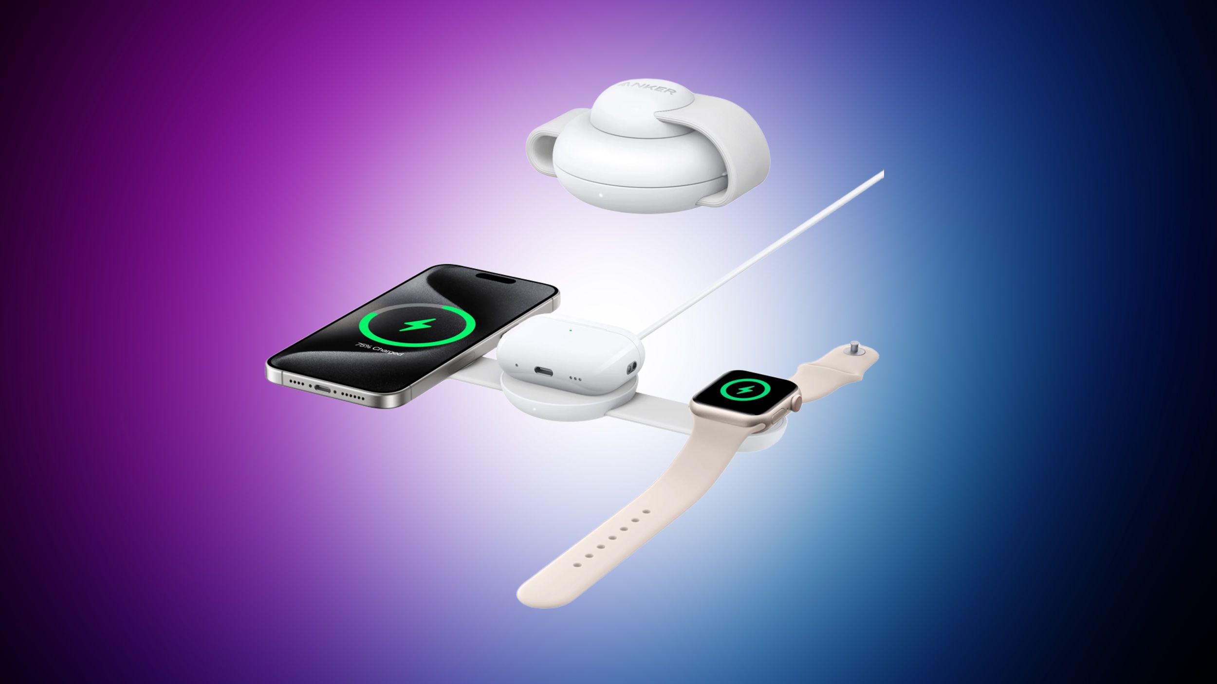
![M4 MacBook Air Drops to Just $849 - Act Fast! [Lowest Price Ever]](https://www.iclarified.com/images/news/97140/97140/97140-640.jpg)
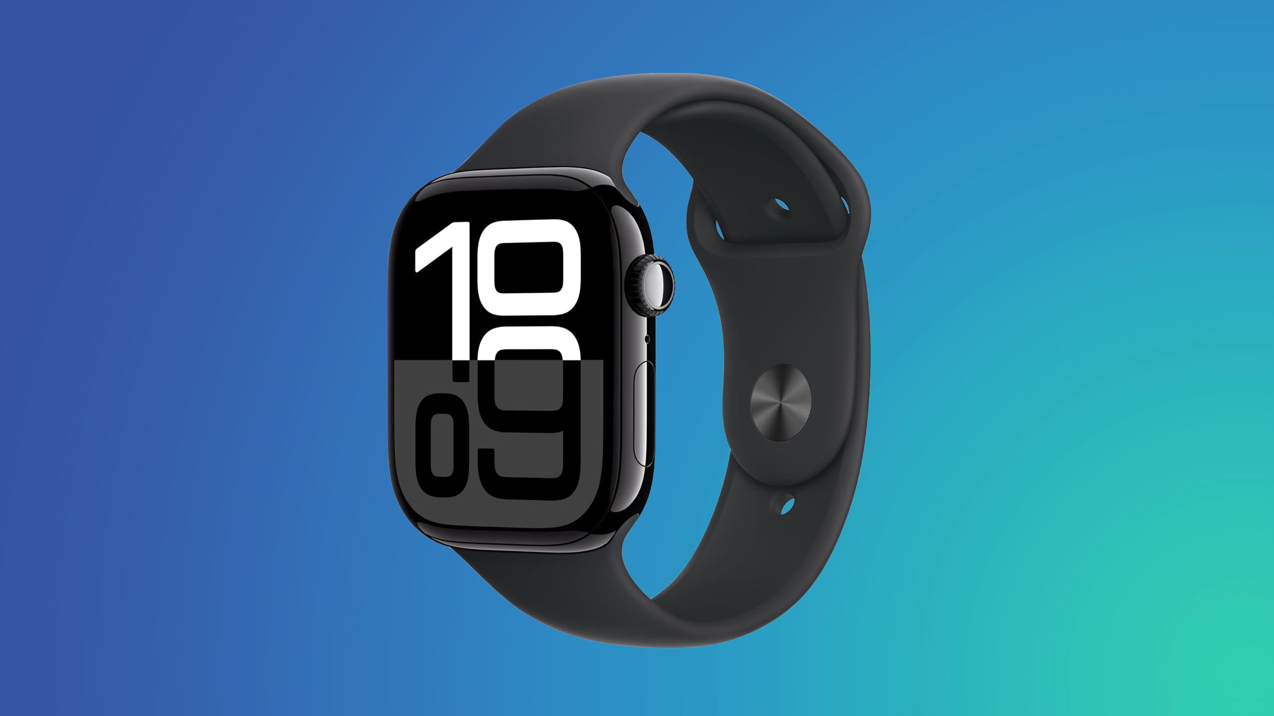
![Apple Smart Glasses Not Close to Being Ready as Meta Targets 2025 [Gurman]](https://www.iclarified.com/images/news/97139/97139/97139-640.jpg)
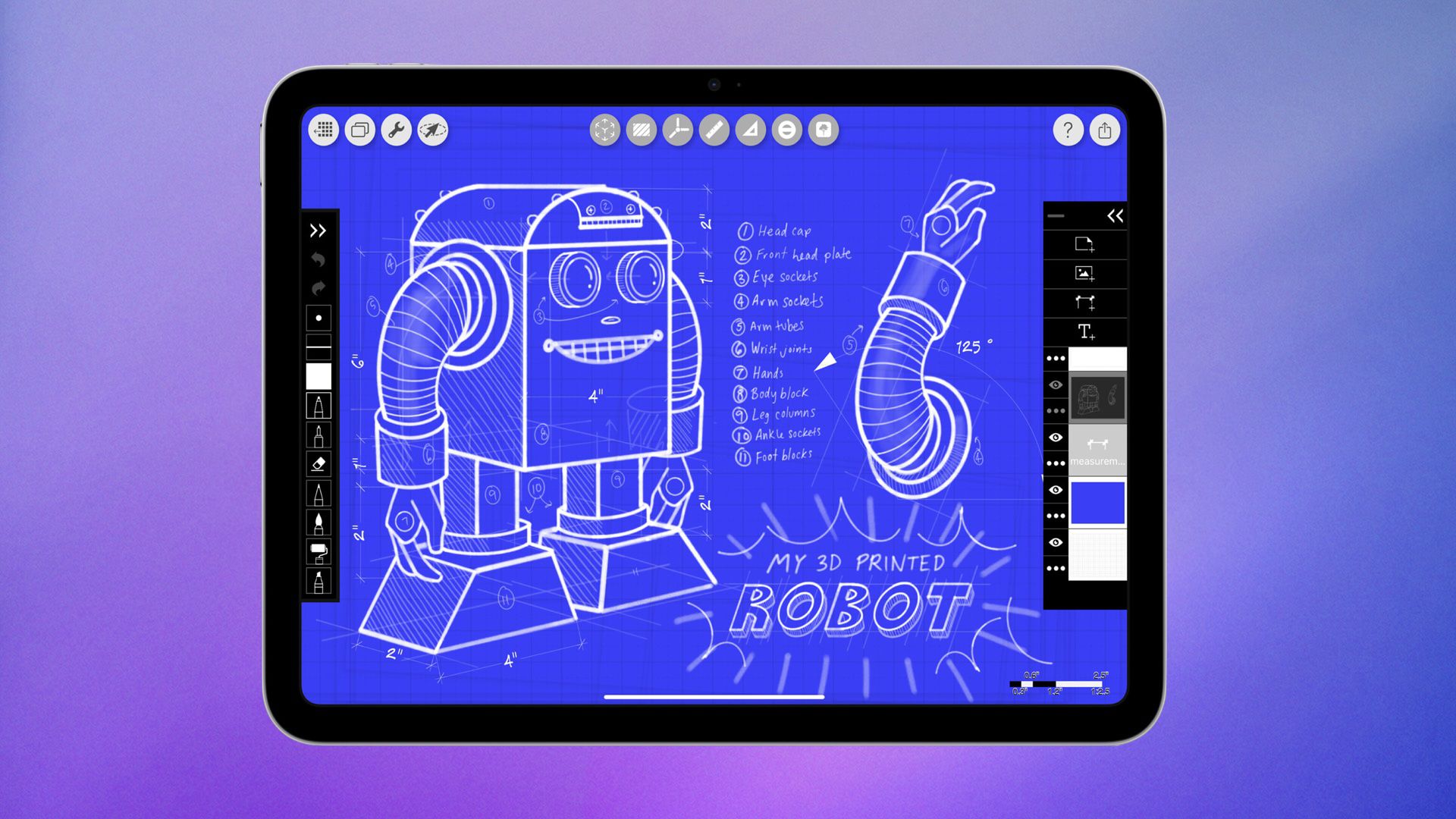
![iPadOS 19 May Introduce Menu Bar, iOS 19 to Support External Displays [Rumor]](https://www.iclarified.com/images/news/97137/97137/97137-640.jpg)


How to Build Self-Healing Layouts in Tailwind CSS Using Aspect Ratios
Ever had a layout break because of an unpredictable image size, dynamic content, or strange embed? Tailwind CSS can help you build *self-healing* layouts using modern aspect-ratio utilities, ensuring components always maintain their structure — no matter what they’re fed. Why Self-Healing Layouts Matter Use cases include: Image galleries with inconsistent image dimensions Video embeds maintaining perfect proportions Cards and sections that never collapse awkwardly Step 1: Use the Aspect-Ratio Utility Tailwind v3+ ships with a built-in aspect-ratio plugin. You can apply it directly to any element: This ensures the iframe always maintains a 16:9 ratio, no matter the viewport size. Step 2: Handling Dynamic Content Sometimes content like CMS-fed images have unknown dimensions. Wrap them in an aspect-ratio container: Now, even if the image doesn't load immediately or has odd proportions, the container maintains visual stability. Step 3: Combine with Grid and Flex for Bulletproof Layouts Using self-healing aspect ratios inside responsive grids makes a huge difference: Each grid item stays perfectly square regardless of screen width, avoiding messy collapsing or stretching. Pros and Cons ✅ Pros Layouts stay consistent no matter the content Zero custom CSS needed — pure Tailwind utilities Improves perceived stability and professionalism ⚠️ Cons May require careful aspect-ratio choices to avoid awkward crops Some legacy content may still need manual handling (e.g., PDFs)

Ever had a layout break because of an unpredictable image size, dynamic content, or strange embed? Tailwind CSS can help you build *self-healing* layouts using modern aspect-ratio utilities, ensuring components always maintain their structure — no matter what they’re fed.
Why Self-Healing Layouts Matter
Use cases include:
- Image galleries with inconsistent image dimensions
- Video embeds maintaining perfect proportions
- Cards and sections that never collapse awkwardly
Step 1: Use the Aspect-Ratio Utility
Tailwind v3+ ships with a built-in aspect-ratio plugin. You can apply it directly to any element:
This ensures the iframe always maintains a 16:9 ratio, no matter the viewport size.
Step 2: Handling Dynamic Content
Sometimes content like CMS-fed images have unknown dimensions. Wrap them in an aspect-ratio container:

Now, even if the image doesn't load immediately or has odd proportions, the container maintains visual stability.
Step 3: Combine with Grid and Flex for Bulletproof Layouts
Using self-healing aspect ratios inside responsive grids makes a huge difference:
Each grid item stays perfectly square regardless of screen width, avoiding messy collapsing or stretching.
Pros and Cons
✅ Pros
- Layouts stay consistent no matter the content
- Zero custom CSS needed — pure Tailwind utilities
- Improves perceived stability and professionalism
⚠️ Cons
- May require careful aspect-ratio choices to avoid awkward crops
- Some legacy content may still need manual handling (e.g., PDFs)