


![[The AI Show Episode 142]: ChatGPT’s New Image Generator, Studio Ghibli Craze and Backlash, Gemini 2.5, OpenAI Academy, 4o Updates, Vibe Marketing & xAI Acquires X](https://www.marketingaiinstitute.com/hubfs/ep%20142%20cover.png)


![[DEALS] The Premium Learn to Code Certification Bundle (97% off) & Other Deals Up To 98% Off – Offers End Soon!](https://www.javacodegeeks.com/wp-content/uploads/2012/12/jcg-logo.jpg)

![From drop-out to software architect with Jason Lengstorf [Podcast #167]](https://cdn.hashnode.com/res/hashnode/image/upload/v1743796461357/f3d19cd7-e6f5-4d7c-8bfc-eb974bc8da68.png?#)


.png?#)


_Christophe_Coat_Alamy.jpg?#)
 (1).webp?#)


![Apple Considers Delaying Smart Home Hub Until 2026 [Gurman]](https://www.iclarified.com/images/news/96946/96946/96946-640.jpg)
![iPhone 17 Pro Won't Feature Two-Toned Back [Gurman]](https://www.iclarified.com/images/news/96944/96944/96944-640.jpg)
![Tariffs Threaten Apple's $999 iPhone Price Point in the U.S. [Gurman]](https://www.iclarified.com/images/news/96943/96943/96943-640.jpg)


"How I Built a Responsive Portfolio Website in 3 Days"
How I Built a Responsive Portfolio Website in 3 Days Introduction A well-designed portfolio website isn't just a showcase of your skills—it’s a powerful tool to attract clients and job opportunities. In this article, I’ll walk you through how I built a fully responsive portfolio website in just 3 days using HTML, CSS, and JavaScript. I’ll also share best practices and tools that made the process efficient. Day 1: Planning and Design Before jumping into coding, I focused on planning the structure and design of the website. Proper planning saves time and prevents unnecessary revisions. 1.1 Wireframing I started with a wireframe to sketch out the layout of my website. I used Figma (a free design tool) to create a simple blueprint with these sections: Home – A hero section with an introduction and call-to-action. About – A short bio with my skills and experience. Projects – Showcasing my best work with links and descriptions. Contact – A contact form and social media links. 1.2 Choosing a Color Scheme I picked a modern and professional color palette. Here’s what I chose: Primary Color: #007BFF (Blue for professionalism) Secondary Color: #F8F9FA (Light Gray for contrast) Accent Color: #FFC107 (Yellow for highlights) A great resource for color schemes: Coolors.co 1.3 Selecting Fonts Typography plays a major role in user experience. I used: Headings: Poppins (bold and stylish) Body Text: Roboto (easy to read) Both fonts were imported from Google Fonts using this snippet: 1.4 Gathering Assets I collected icons, images, and logos from free sources: Icons: FontAwesome Images: Unsplash Day 2: Development Once the design was ready, I started coding the site from scratch. Here’s how I structured my development process: 2.1 Writing the HTML Structure I followed semantic HTML principles for better SEO and accessibility: My Portfolio About Projects Contact 2.2 Styling with CSS for Responsiveness I used CSS Flexbox and Grid to make the layout responsive. .container { display: flex; flex-wrap: wrap; justify-content: space-between; } .project-grid { display: grid; grid-template-columns: repeat(auto-fit, minmax(300px, 1fr)); gap: 20px; } I also added media queries to adjust styles for mobile screens: @media (max-width: 768px) { .container { flex-direction: column; } } 2.3 Adding JavaScript for Interactivity I included JavaScript for smooth scrolling and a dynamic theme switcher. document.querySelectorAll('a[href^="#"]').forEach(anchor => { anchor.addEventListener('click', function(e) { e.preventDefault(); document.querySelector(this.getAttribute('href')).scrollIntoView({ behavior: 'smooth' }); }); }); Day 3: Testing and Deployment With the website built, I focused on testing and deployment to ensure it works flawlessly across devices. 3.1 Cross-Browser Testing I tested the site on multiple browsers: ✅ Google Chrome ✅ Mozilla Firefox ✅ Microsoft Edge 3.2 Mobile Optimization I used Google Chrome DevTools to check how the website looks on different screen sizes (iPhone, Android, iPad, etc.). 3.3 Hosting & Deployment To make the site live, I used Netlify (a free hosting platform). Steps: Created a free Netlify account. Uploaded my project to GitHub. Connected GitHub to Netlify. Clicked “Deploy” and my site was live! A great alternative is Vercel. Check Out My Work! I love helping others build stunning, responsive websites! If you need a personal or business website, check out my Fiverr gig below:
How I Built a Responsive Portfolio Website in 3 Days
Introduction
A well-designed portfolio website isn't just a showcase of your skills—it’s a powerful tool to attract clients and job opportunities. In this article, I’ll walk you through how I built a fully responsive portfolio website in just 3 days using HTML, CSS, and JavaScript. I’ll also share best practices and tools that made the process efficient.
Day 1: Planning and Design
Before jumping into coding, I focused on planning the structure and design of the website. Proper planning saves time and prevents unnecessary revisions.
1.1 Wireframing
I started with a wireframe to sketch out the layout of my website. I used Figma (a free design tool) to create a simple blueprint with these sections:
Home – A hero section with an introduction and call-to-action.
About – A short bio with my skills and experience.
Projects – Showcasing my best work with links and descriptions.
Contact – A contact form and social media links.
1.2 Choosing a Color Scheme
I picked a modern and professional color palette. Here’s what I chose:
Primary Color: #007BFF (Blue for professionalism)
Secondary Color: #F8F9FA (Light Gray for contrast)
Accent Color: #FFC107 (Yellow for highlights)
A great resource for color schemes: Coolors.co
1.3 Selecting Fonts
Typography plays a major role in user experience. I used:
Headings: Poppins (bold and stylish)
Body Text: Roboto (easy to read)
Both fonts were imported from Google Fonts using this snippet:
1.4 Gathering Assets
I collected icons, images, and logos from free sources:
Icons: FontAwesome
Images: Unsplash
Day 2: Development
Once the design was ready, I started coding the site from scratch. Here’s how I structured my development process:
2.1 Writing the HTML Structure
I followed semantic HTML principles for better SEO and accessibility:
My Portfolio
2.2 Styling with CSS for Responsiveness
- I used CSS Flexbox and Grid to make the layout responsive.
.container {
  display: flex;
  flex-wrap: wrap;
  justify-content: space-between;
}

.project-grid {
  display: grid;
  grid-template-columns: repeat(auto-fit, minmax(300px, 1fr));
  gap: 20px;
}
- I also added media queries to adjust styles for mobile screens:
@media (max-width: 768px) {
  .container {
    flex-direction: column;
  }
}
2.3 Adding JavaScript for Interactivity
I included JavaScript for smooth scrolling and a dynamic theme switcher.
document.querySelectorAll('a[href^="#"]').forEach(anchor => {
  anchor.addEventListener('click', function(e) {
    e.preventDefault();
    document.querySelector(this.getAttribute('href')).scrollIntoView({
      behavior: 'smooth'
    });
  });
});
Day 3: Testing and Deployment
With the website built, I focused on testing and deployment to ensure it works flawlessly across devices.
3.1 Cross-Browser Testing
I tested the site on multiple browsers:
✅ Google Chrome
✅ Mozilla Firefox
✅ Microsoft Edge
3.2 Mobile Optimization
I used Google Chrome DevTools to check how the website looks on different screen sizes (iPhone, Android, iPad, etc.).
3.3 Hosting & Deployment
To make the site live, I used Netlify (a free hosting platform). Steps:
Created a free Netlify account.
Uploaded my project to GitHub.
Connected GitHub to Netlify.
Clicked “Deploy” and my site was live!
A great alternative is Vercel.
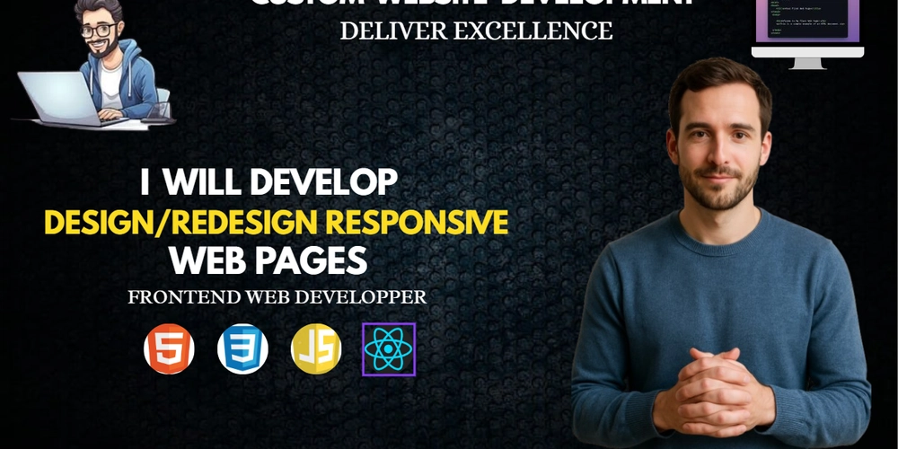
Check Out My Work!
I love helping others build stunning, responsive websites! If you need a personal or business website, check out my Fiverr gig below: